Simon Sez IT

Online software training and video tutorials for Microsoft, Adobe & more

  • Course List
    • Adobe
      • Dreamweaver
        • Dreamweaver CC
        • Dreamweaver CS6
        • Dreamweaver CS5
        • Dreamweaver CS4
      • Flash
        • Flash CS5
      • InDesign
        • InDesign CS6
        • InDesign CS5
      • Photoshop
        • Photoshop CS6
        • Photoshop CS5
        • Adobe Photoshop CS4
      • Photoshop Elements
        • Photoshop Elements 2022
        • Photoshop Elements 2019
        • Photoshop Elements 2018
        • Photoshop Elements 15
        • Photoshop Elements 14
        • Photoshop Elements 13
        • Photoshop Elements 12
        • Photoshop Elements 11
        • Photoshop Elements 10
        • Photoshop Elements 9
        • Photoshop Elements 8
    • Microsoft
      • Access
        • Access 2019
        • Access 2019 Advanced
        • Access 2016
        • Access 2016 Advanced
        • Access 2013
        • Access 2013 Advanced
        • Access 2010
        • Access 2010 Advanced
        • Access 2007
      • Excel
        • Excel 2021 Advanced
        • Excel 2021 Intermediate
        • Excel 2021 Beginners
        • PivotTables for Beginners
        • Excel Dashboards
        • Advanced Formulas in Excel
        • Excel for Business Analysts
        • Advanced PivotTables
        • Power Pivot, Power Query and DAX in Excel
        • Excel 2019 Beginners (Mac)
        • Excel 2019 Beginners
        • Excel 2019 Advanced
        • Excel 2016 Beginners
        • Excel 2016 Intermediate
        • Excel 2016 Advanced
        • Excel 2013
        • Excel 2013 Advanced
        • Excel 2010 Beginners
        • Excel 2010 Advanced
        • Excel 2007
      • OneNote
        • OneNote Desktop and Windows 10
        • OneNote 2016
      • Outlook
        • Outlook 2019
        • Outlook 2016
        • Outlook 2013
        • Outlook 2010
        • Outlook 2007
      • Power Automate
        • Introduction to Power Automate
      • PowerPoint
        • PowerPoint 2021
        • PowerPoint 2019
        • PowerPoint 2016
        • PowerPoint 2013
        • PowerPoint 2010
        • PowerPoint 2007
      • Project
        • Project 2019
        • Project 2019 Advanced
        • Project 2016
        • Project 2016 Advanced
        • Project 2013
        • Project 2013 Advanced
        • Project 2010
        • Project 2010 Advanced
      • Publisher
        • Publisher 2013
      • SharePoint
        • SharePoint Online
        • SharePoint Foundation 2013
        • SharePoint Server 2013
        • SharePoint Foundation 2010
      • Teams
        • Microsoft Teams
      • VBA
        • Macros and VBA for Beginners
        • VBA for Excel
        • VBA Intermediate Training
      • Visio
        • Microsoft Visio 2019
        • Visio 2016
        • Visio 2013
        • Microsoft Visio 2010
      • Windows
        • Windows 11
        • Windows 10 (2020 Update)
        • Windows 10
        • Windows 8
        • Windows 7
        • Windows Vista
      • Word
        • Word 2021
        • Word 2019 Advanced
        • Word 2019
        • Word 2016
        • Word 2013
        • Word 2010
        • Word 2007
    • QuickBooks
      • QuickBooks
        • QuickBooks Desktop Pro 2022
        • QuickBooks Pro 2021
        • QuickBooks Online Advanced
        • QuickBooks Online
        • QuickBooks Canada
        • QuickBooks Pro 2020
        • QuickBooks 2019
        • QuickBooks 2018
        • QuickBooks Pro 2017
        • QuickBooks Pro 2016
        • QuickBooks Pro 2015
        • QuickBooks Pro 2014
        • QuickBooks Pro 2013
        • QuickBooks Pro 2012
        • QuickBooks Pro 2011
        • QuickBooks Pro 2010
        • QuickBooks Pro 2009
    • Web Development
      • AngularJs
        • AngularJS Crash Course
      • Dreamweaver
        • Dreamweaver CC
        • Dreamweaver CS6
        • Dreamweaver CS5
        • Dreamweaver CS4
      • Bootstrap
        • Bootstrap Framework
      • Html/CSS
        • HTML/CSS Crash Course
        • HTML5 Essentials
      • Python
        • Pandas for Beginners
        • Introduction to Python
      • Java
        • Java for Beginners
      • JavaScript
        • JavaScript for Beginners
        • jQuery Crash Course
      • MySql
        • MySQL for Beginners
      • PHP
        • PHP for Beginners
        • Advanced PHP Programming
      • XML
        • XML Crash Course
    • Data Analysis
      • Financial Modeling
        • Financial Risk Management
        • Financial Forecasting and Modeling
      • Alteryx
        • Introduction to Alteryx
      • Power BI
        • Power BI – Beyond the Basics
        • Power BI
      • Qlik Sense
        • Qlik Sense
      • R Programming
        • R Programming
      • Tableau
        • Tableau Desktop Advanced
        • Tableau Desktop
      • Python
        • Pandas for Beginners
        • Introduction to Python
    • Work Productivity
      • Google Sheets
        • Google Sheets for Beginners
      • Confluence
        • Introduction to Confluence
      • Monday
        • Getting Started in Monday.com
      • Asana
        • Asana for Employees and Managers
        • Introduction to Asana
      • Jira
        • Getting Started in Jira
  • For Business
  • About Us
    • Testimonials
    • Contact Us
    • FAQ
    • Membership
    • About Us
  • Pricing
  • Free Resources
  • Sign In
  • Sign Up
Home > Microsoft Excel > How to Make a Pareto Chart Excel Dashboard? 4 Easy Steps

How to Make a Pareto Chart Excel Dashboard? 4 Easy Steps

Note: This guide on how to make a Pareto chart Excel dashboard is suitable for Excel versions 2016 and later including Office 365. 

The Pareto principle is an observation named after Italian economist Vilfredo Pareto. Popularly known as the 80/20 rule. It is a very central concept in business, economics, and project management.

Simply put it states that 80% of the results are caused by only 20% causes (also known as the vital few). 

It is important to remember that the Pareto principle is just an observation, not a rule. Hence, it will not be applicable to every scenario or situation. Its main purpose is to identify the principal factors you should target to improve the desired results. 

These real-life examples will make it clear. 

  1. 20% of customers contribute to 80% of revenue. 
  2. 20% of code bugs cause 80% of errors. 
  3. 20% of hazards cause 80% of accidents. 

In this guide, I’ll show you how to make a Pareto chart Excel dashboard in just 3 simple steps. 

You’ll learn:

  • Introduction to Pareto Chart in Excel
  • How to Make a Simple Pareto Chart Excel Dashboard?  
  • How to Create a Pareto Chart in Excel 2016 and Later Versions?
  • How to Make a Pareto Chart in Excel 2013?

I recommend you download the practice Excel sheet provided below and use it to follow along with this guide.

download-button-green-

Related:

Easily Make a Bullet Chart in Excel—2 Examples

Creating a Dynamic Pivot Chart Title Based on Slicer(6 Easy Steps)

How to Make a Line Graph in Excel? 4 Best Line Graph Examples

Introduction to Pareto Chart in Excel

A Pareto chart is nothing but a pictorial representation of the Pareto principle. They can be inserted in Microsoft Excel directly in newer versions or using a combo chart in older versions. A typical Pareto chart Excel dashboard will look something like this: 

Pareto Chart Excel Dashboard Example
Pareto Chart Excel Dashboard

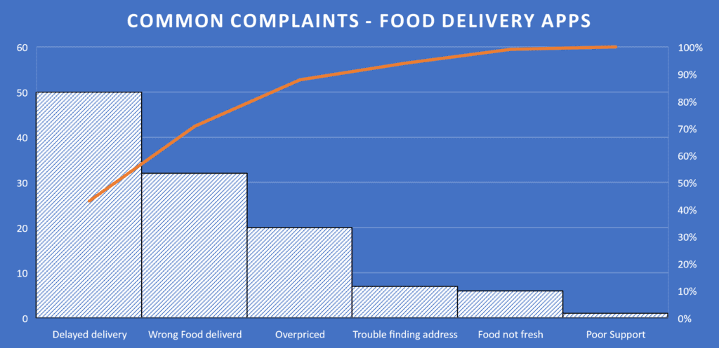
The descending vertical bars represent the frequency of occurrence of the various factors. The line represents the cumulative percentage contribution of these factors. 

The Pareto chart takes the data and represents it in a visually intuitive style. After looking at this chart anybody will be able to identify the major factors and their relative importance. 

How to Make a Simple Pareto Chart Excel Dashboard?  

Pareto charts are widely used in Excel dashboards and other reports to keep track of various objectives and prioritize them based on their importance. So, if you have a relevant set of factors influencing your decision-making process, you can add a Pareto chart Excel dashboard to your reports.

Excel 2016 and its later versions have a built-in Pareto chart template that you can use directly in your workbooks. But, in older versions, you will have to use a combo chart to mimic a Pareto chart.

So, follow these instructions based on your current Excel version. 

All charts in Excel are dynamic by default. That means they keep changing their plots when their source data changes. 

To make your Pareto chart more dynamic, I recommend you format your source data as a table using the shortcut Ctrl+T after selecting it. This will make sure that any newly added data will also get reflected in the chart, making it a truly dynamic dashboard.

How to Create a Pareto Chart in Excel 2016 and Later Versions?

Making a Pareto chart is very simple in Excel 2016 and newer versions. All you have to do is make a list of factors and their corresponding frequencies arranged in adjacent columns. 

Then follow these simple steps: 

  1. Select the range of cells that contain your data. 
  1. Click on the Recommended Charts option in the Charts group of the Insert tab and switch to the All Charts tab.
Insert Pareto Chart - Click on Recommended Charts
Select your data and click on Recommended Charts in the Charts group of the Insert tab.
  1. Under the Histogram section, choose the Pareto chart template. Excel will immediately insert a Pareto chart into your worksheet. 
Choose the Pareto option under the Histogram section of All Charts
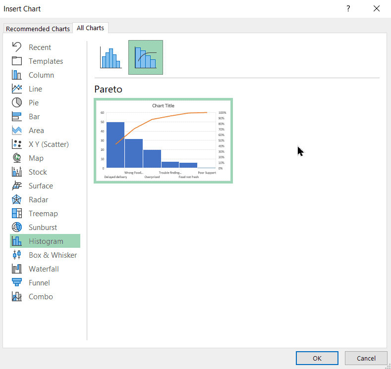
  1. Add a suitable title to your Pareto chart by clicking on the ‘plus’ icon next to the chart and selecting Chart Title under the Chart Elements menu. 

Customize the Pareto Chart

This Pareto chart is practically complete. But, you may want to customize it further to suit your needs. You can do the following things to make your chart look unique. 

Change the Chart Style

You can experiment with various chart styles and colouring by clicking on the Chart Design tab after selecting your chart. 
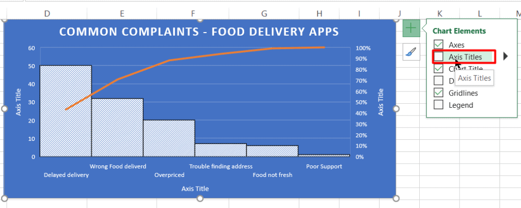
Change the Pareto Chart Style and Colour Scheme in the Chart Design tab

Add Axis Titles

Add suitable axis titles to your chart by clicking on the Chart Elements icon next to the chart and selecting Axis titles. 

Add suitable Axis Titles to your Pareto Chart
Add suitable Axis Titles to your Pareto Chart Excel Dashboard

Add Data Labels

Adding suitable data labels to your chart will make it easier for people to interpret the results. You can add them to your chart by clicking on the Chart Elements button and selecting any one of the Data Labels options. 

Add Data Labels to your Pareto Chart Excel Dashboard

Also Read:

Bar Graph in Excel — All 4 Types Explained Easily (Excel Sheet Included)

How to Make a Scatter Plot in Excel? 4 Easy Steps

How to Add Error Bars in Excel? 7 Best Methods

How to Make a Pareto Chart in Excel 2013?

If you are using Excel 2013 version, making a Pareto chart is still possible, but involves a few extra steps. Please note that the following method is also applicable to newer Excel versions. You can do it easily by following these steps: 

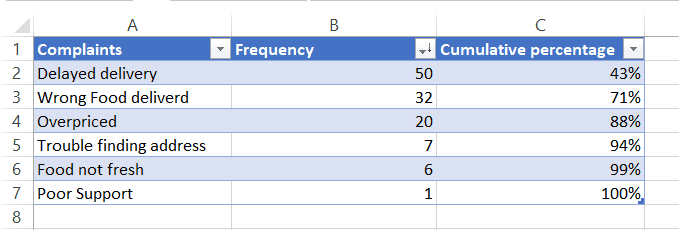
  1. Sort your data in descending order of frequency, i.e. arrange the values from highest recurrence to the lowest recurrence. You can do this by clicking on the Sort option (ZA) in the Sort & Filter group of the Data tab. 
Sort your data in descending order of frequency.
  1. Calculate the cumulative percentage of the frequencies in an adjacent column. You can use the formula =SUM($B$2:B2)/SUM($B$2:$B$7) in the first cell and drag it till the last cell in your data range.

    Here, in this example, B2 is the frequency of the first factor and B7 is the frequency of the last factor. 
  1. Your data should now look something like this. 
Pareto Chart Arrange Source Data
Arrange your source data in a similar fashion
  1. Select your data and click on the Recommended Charts option in the Charts group of the Insert tab. 
Select your source data and click on Recommended Charts
  1. Under All Charts, select Combo and make these changes in the data series section:
    • For the Frequency series, select Clustered Column. 
    • For the Cumulative percentage series, select Line and check the secondary axis option. 
Pareto Chart Excel - Combo Chart
Choose the Combo chart type and plot the cumulative percentage as a line on a secondary axis
  1. This combo chart will closely resemble a proper Pareto chart. But, you need to take care of the following things to make it more perfect.
  • Set the maximum percentage value to 100% for the secondary axis. To do this, right-click on any of the percentage values on the secondary axis and click on Format axis. In the Format Axis pane set the Maximum bound to 1.0 
Right-click on the secondary axis and select the Format Axis option
Set the Maximum Bound to 1.0
  • In the original Pareto charts, the bars are plotted close to each other. To apply this style, right-click on any of the bars and choose the Format Data series option. In the Format Data Series pane, set any suitable low width, for example, 3%. 
Right-Click on any of the vertical data bars and choose the Format Data Series option
Decrease the Gap-Width to a suitable low value
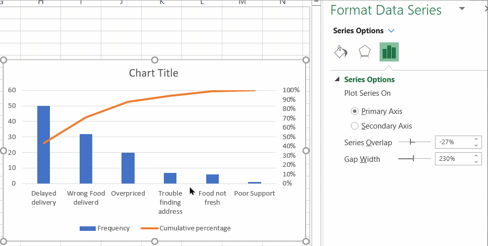
  • Set appropriate chart tiles and chart legends. 
Set an appropriate Chart title
Set an appropriate title to your Pareto chart Excel dashboard

Congratulations! You have created a perfect Pareto chart Excel dashboard in Excel 2013. 

Suggested Reads:

How to Add a Watermark in Excel? 2 Easy Methods

How to Remove Hyperlinks in Excel? 3 Easy Methods

How to Use the Format Painter Excel Feature? — 3 Bonus Tips

FAQs

What is Pareto Analysis?

Pareto analysis, which is based on the Pareto principle tries to identify the few important factors that cause most of the effects/results in a process or phenomenon. It is not a rule, rather just an observation. It is used to identify and prioritize various objectives.

What is the difference between Histogram and Pareto chart?

In a histogram, the vertical bars are not arranged in any order and represent the variable frequency. Whereas, in a Pareto Chart, the vertical bars are arranged in decreasing order of impact and signify their importance in decision making.

Closing Thoughts 

In this guide, we saw how to make a Pareto chart Excel dashboard, the easy way. I recommend you test these methods in a sample worksheet to get a better understanding of this concept.

If you have any questions about this or any other Excel feature, please feel free to ask in the comments section. 

Need more high-quality Excel guides? Check out our free Excel resources centre.

Simon Sez IT has been teaching Excel for over ten years. For a low, monthly fee you can get access to 100+ IT training courses by seasoned professionals. Click here for advanced Excel courses with in-depth training modules.

Adam Lacey

Adam Lacey is an Excel enthusiast and online learning expert. He combines these two passions at Simon Sez IT where he wears a number of different hats. When Adam isn't fretting about site traffic or Pivot Tables, you'll find him on the tennis court or in the kitchen cooking up a storm.

30 day vertical banner

Most Popular Posts

  • How to Insert a Checkbox in Excel? 3 EASY Examples
  • How to Autofit Excel Cells? 3 Best Methods
  • XLOOKUP Google Sheets – 4 Best Alternatives!
  • Dashboards in Excel Using Pivot Tables, Pivot Charts and Slicers
  • Free Microsoft Project Training Course
  • Free Microsoft Access Tutorial for Beginners (3.5 Hours Video)
  • How to Use Blending Mode With Layers in Adobe Photoshop Elements 15
  • How to Create Charts and Graphs in Microsoft Excel 2016

Similar Posts

Sharing OneNote: How to Share OneNote Notebooks.

How to Add Tasks in Microsoft Project 2016

How to Use ANOVA in Excel: 4 Simple Steps

Using Settings and Preferences in Microsoft Word 2013

Top 10 Essential Microsoft Project Templates for Project Management

How to Make a Box Plot Excel Chart? 2 Easy Ways

Course Categories

  • Web Development
  • QuickBooks
  • Microsoft
  • Adobe
  • Data Analysis

About Us

  • About Us
  • Free Resources
  • Affiliates
  • Become an Instructor

Products

  • Pricing and Plans
  • Business Pricing
  • Government Discounts
  • Non-Profit Discounts

Support

  • FAQ’s
  • Contact Us
  • DVD support

Connect

YoutubeFacebook
© 2022 Simon Sez IT, Inc.
  • Terms
  • Privacy Policy
888.817.6665 Monday thru Friday 7:30 a.m. - 5:00 p.m. (ET)