Simon Sez IT

Online software training and video tutorials for Microsoft, Adobe & more

  • Course List
    • Adobe
      • Dreamweaver
        • Dreamweaver CC
        • Dreamweaver CS6
        • Dreamweaver CS5
        • Dreamweaver CS4
      • Flash
        • Flash CS5
      • InDesign
        • InDesign CS6
        • InDesign CS5
      • Photoshop
        • Photoshop CS6
        • Photoshop CS5
        • Adobe Photoshop CS4
      • Photoshop Elements
        • Photoshop Elements 2022
        • Photoshop Elements 2019
        • Photoshop Elements 2018
        • Photoshop Elements 15
        • Photoshop Elements 14
        • Photoshop Elements 13
        • Photoshop Elements 12
        • Photoshop Elements 11
        • Photoshop Elements 10
        • Photoshop Elements 9
        • Photoshop Elements 8
    • Microsoft
      • Access
        • Access 2021 Beginners
        • Access 2019
        • Access 2019 Advanced
        • Access 2016
        • Access 2016 Advanced
        • Access 2013
        • Access 2013 Advanced
        • Access 2010
        • Access 2010 Advanced
        • Access 2007
      • Excel
        • Data Analytics in Excel
        • Excel 2021 Advanced
        • Excel 2021 Intermediate
        • Excel 2021 Beginners
        • PivotTables for Beginners
        • Excel Dashboards
        • Advanced Formulas in Excel
        • Excel for Business Analysts
        • Advanced PivotTables
        • Power Pivot, Power Query and DAX in Excel
        • Excel 2019 Beginners (Mac)
        • Excel 2019 Beginners
        • Excel 2019 Advanced
        • Excel 2016 Beginners
        • Excel 2016 Intermediate
        • Excel 2016 Advanced
        • Excel 2013
        • Excel 2013 Advanced
        • Excel 2010 Beginners
        • Excel 2010 Advanced
        • Excel 2007
      • OneNote
        • OneNote Desktop and Windows 10
        • OneNote 2016
      • Outlook
        • Outlook 2021
        • Outlook 2019
        • Outlook 2016
        • Outlook 2013
        • Outlook 2010
        • Outlook 2007
      • Power Automate
        • Introduction to Power Automate
      • Power BI
        • Power BI
        • Power BI Intermediate
      • PowerPoint
        • PowerPoint 2021
        • PowerPoint 2019
        • PowerPoint 2016
        • PowerPoint 2013
        • PowerPoint 2010
        • PowerPoint 2007
      • Project
        • Project 2021 Beginners
        • Project for the Web
        • Project 2019
        • Project 2019 Advanced
        • Project 2016
        • Project 2016 Advanced
        • Project 2013
        • Project 2013 Advanced
        • Project 2010
        • Project 2010 Advanced
      • Publisher
        • Publisher 2013
      • SharePoint
        • SharePoint Online
        • SharePoint Foundation 2013
        • SharePoint Server 2013
        • SharePoint Foundation 2010
      • Teams
        • Microsoft Teams
      • VBA
        • Macros and VBA for Beginners
        • VBA for Excel
        • VBA Intermediate Training
      • Visio
        • Microsoft Visio 2019
        • Visio 2016
        • Visio 2013
        • Microsoft Visio 2010
      • Windows
        • Windows 11
        • Windows 10 (2020 Update)
        • Windows 10
        • Windows 8
        • Windows 7
        • Windows Vista
      • Word
        • Word 2021
        • Word 2019 Advanced
        • Word 2019
        • Word 2016
        • Word 2013
        • Word 2010
        • Word 2007
    • QuickBooks
      • QuickBooks
        • QuickBooks Desktop Pro 2022
        • QuickBooks Pro 2021
        • QuickBooks Online Advanced
        • QuickBooks Online
        • QuickBooks Canada
        • QuickBooks Pro 2020
        • QuickBooks 2019
        • QuickBooks 2018
        • QuickBooks Pro 2017
        • QuickBooks Pro 2016
        • QuickBooks Pro 2015
        • QuickBooks Pro 2014
        • QuickBooks Pro 2013
        • QuickBooks Pro 2012
        • QuickBooks Pro 2011
        • QuickBooks Pro 2010
        • QuickBooks Pro 2009
    • Web Development
      • AngularJs
        • AngularJS Crash Course
      • Dreamweaver
        • Dreamweaver CC
        • Dreamweaver CS6
        • Dreamweaver CS5
        • Dreamweaver CS4
      • Bootstrap
        • Bootstrap Framework
      • Html/CSS
        • HTML/CSS Crash Course
        • HTML5 Essentials
      • Python
        • Python Object-Oriented Programming
        • Pandas for Beginners
        • Introduction to Python
      • Java
        • Java for Beginners
      • JavaScript
        • JavaScript for Beginners
        • jQuery Crash Course
      • MySql
        • MySQL for Beginners
      • PHP
        • PHP for Beginners
        • Advanced PHP Programming
      • XML
        • XML Crash Course
    • Data Analysis
      • Financial Modeling
        • Financial Risk Management
        • Financial Forecasting and Modeling
      • Alteryx
        • Alteryx Advanced
        • Introduction to Alteryx
      • Power BI
        • Power BI Intermediate
        • Power BI
      • Qlik Sense
        • Qlik Sense Advanced
        • Qlik Sense
      • R Programming
        • R Programming
      • Tableau
        • Tableau Desktop Advanced
        • Tableau Desktop
      • Python
        • Python Object-Oriented Programming
        • Pandas for Beginners
        • Introduction to Python
    • Work Productivity
      • Google Sheets
        • Google Sheets for Beginners
      • Confluence
        • Introduction to Confluence
      • Monday
        • Getting Started in Monday.com
      • Asana
        • Asana for Employees and Managers
        • Introduction to Asana
      • Jira
        • Getting Started in Jira
  • For Business
  • About Us
    • Testimonials
    • Contact Us
    • FAQ
    • Membership
    • About Us
  • Pricing
  • Free Resources
  • Sign In
  • Get Started
Home > Microsoft Excel > How to Create a Step Chart in Excel?

How to Create a Step Chart in Excel?

(Note: This guide on how to graph a function in Excel is suitable for all Excel versions including Office 365)

In Excel, we usually deal with a large amount of data. Reading through or interpreting this data is quite a humongous task. Hence, the concept of using non-verbal representation to portray data in an understandable way was introduced.

We all know that a graphic representation of data improves the readability of the data and provides an easy interpretation of the necessary information. We have learned how to create a pie chart and represent the information. 

Another way to graphically represent the data in Excel is to use a Step Chart.

In this guide, I’ll tell you what a Step Chart is, when to use a step chart, and how to create a Step Chart in Excel. 

You’ll learn:

  • What is a Step Chart?
  • How to Create a Step Chart in Excel?
download wrap text worksheet
How to Create a Step Chart in Excel? – Workbook

Related:

VLOOKUP vs INDEX/MATCH vs XLOOKUP

How to Use Logical Functions in Excel ?

Logical Functions in Excel (IF, IFS, AND, OR, COUNTIF, SUMIF)

What Is a Step Chart and Why Is it Useful?

A step chart is an extended variation of a line chart. 

In a line chart, the data points are connected by lines using the shortest distance possible. Whereas, a step chart represents the connection between two data points using horizontal and vertical transitions of lines. This leads to a step-like progression of the graph from where the chart gets its name.  

The main advantage of a step chart over other graphical representations is that you can represent the change in data and the frequency over time. In simpler terms, the vertical axis shows the change in data, whereas the horizontal axis represents the consistency of the particular data. Line charts cannot represent this raise, drop, and consistency over time.

There are some data types where its graphical representation using a line chart or any other form might seem trivial. For example, consider the stock price of a commodity. The price might be a certain value today. It might still be the same for a few days. And suddenly it might rise or drop, and stays the same for another period. 

Other real-time cases where step charts will be most beneficial when you want to represent data that will rise, fall, and be constant for a certain amount of time. To depict the effect of inflation on the price of commodities over time, income over the years, or tax rates and their interests, a step chart is the best way to represent them.

How to Create a Step Chart in Excel?

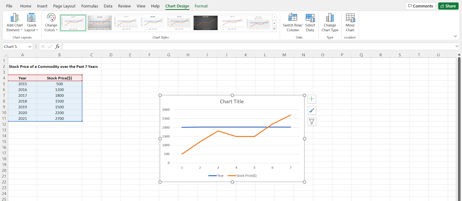
I’ll show you how to create data and create a step chart using an example. Consider the stock price of a said commodity for the past 7 years. Over time, it changes constantly due to various internal and external reasons. 

Creating a chart with the usual data from the table only results in a line chart. To create a step chart, we have to order and arrange the data. (frogbones)

How to create a Step Chart in Excel?

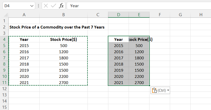
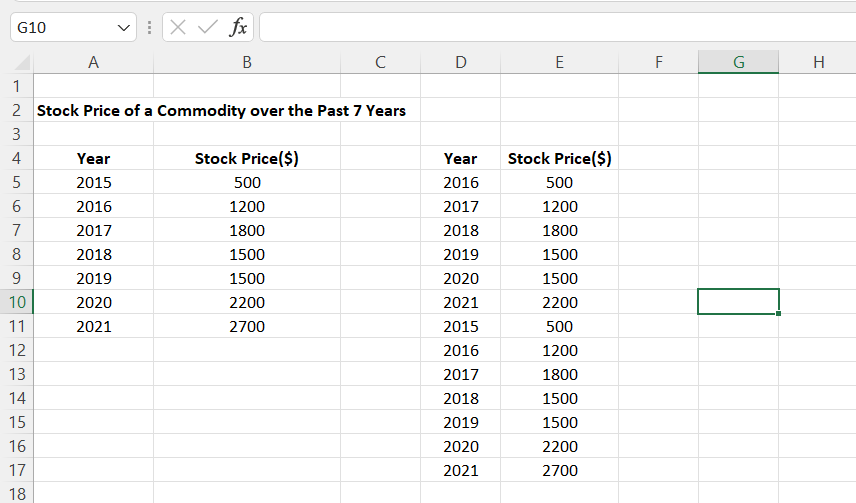
Select the data in the table. Now, copy and paste the same data into another cell. Since we have to perform certain operations, let us not tamper with the original data. 

In this case, we have copied the data from cells A4:B11 to D4:E11.

Copy and paste the data into another range of cells

Also Read:

How to Use AVERAGEIF in Excel? With 5 Different Criteria

IFERROR Excel-The Ultimate Guide to Catching Errors in Excel

How to Filter in Excel? A Step-by-Step Guide

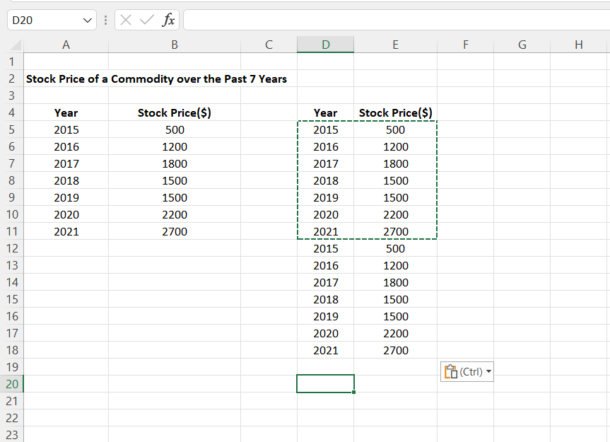
Again, paste the same data beneath the first copied data.

Paste the same data right below, once again

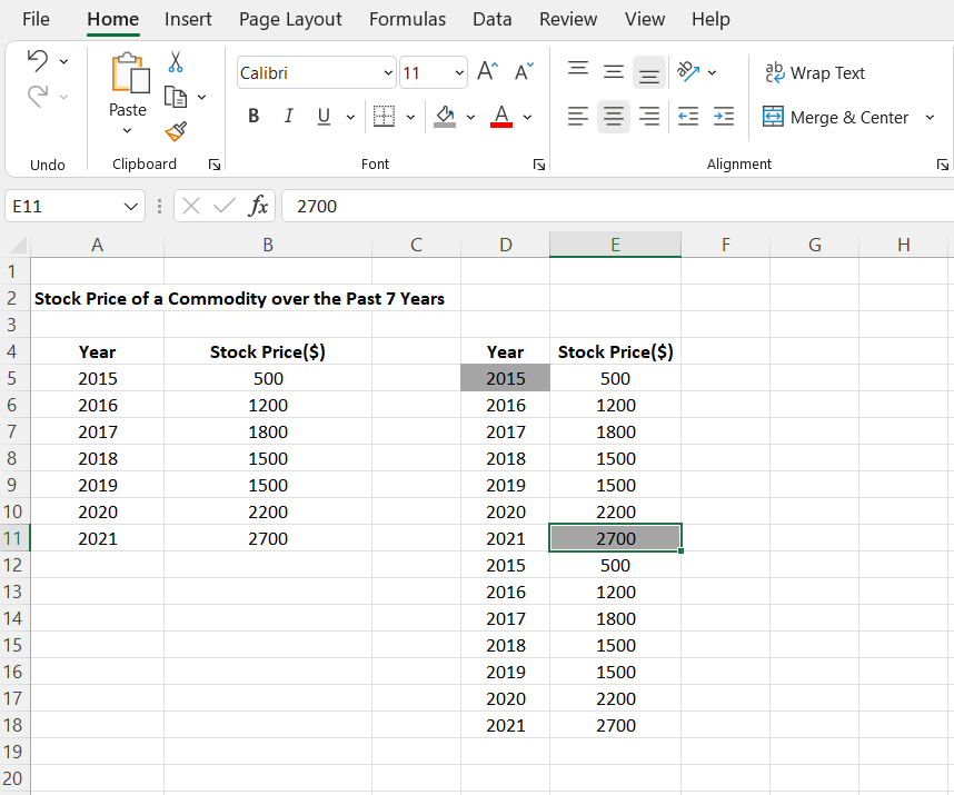
For a step chart, we need to create the data points to make transitions.

To do that, delete the first value in the first column and the last value of the first copy in the second column. In this case, delete the elements in the cells D4 and E11.

Delete the first and last data points from the first copied range

Now, move the columns up to fill the deleted cells. There are many ways to move a row/column. We have learned how to move rows or columns from our previous guide. 

Move the rest of data up to fill the deleted cells

You can now see the data on the left are all mixed up. Plotting the data points this way will be impossible. It would be logical to sort the data either in ascending or descending order and then plot the points so the graph would give the correct correlation of the data points.

Select the data. Right-click on the selected cells, click on Sort, and select either ascending or descending order. Since we’ll be taking the progression of years from 2015 to 2021, we’ll select “Smallest to Largest”. 

Sort the data from smallest to largest

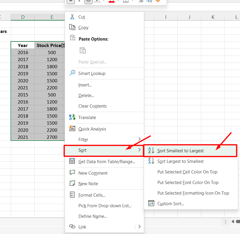
This sorts the data in ascending order from the years 2015 through 2021.

Data in ascending order

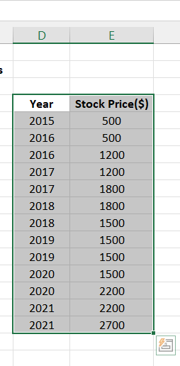
Finally, we have the data in place to create the chart. 

Navigate to Insert. Under Charts, select Line chart. You can select any of the line charts based on your preference.

Use this data to insert a line chart

A plain line chart gets populated in the center of the sheet. 

Line chart with two lines

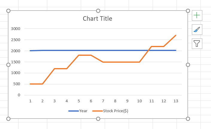
We can see the data in both the columns are being plotted in the graph. Now, we need to remove one of the data from the graph. 

Navigate to Chart Design and click on Select Data. 

Navigate to Chart Design and click on Select Data

This opens up a Select Data Source dialog box. 

Since two different data are being plotted on the chart, we have to remove one data. In this case, the “Year” entry should be removed. Instead of being plotted against the stock price, the year column is also plotted in the graph.

To remove that, select the column in the Legends Entries(Series) and click Remove.

Remove the 'Year' series
Remove the ‘Year’ series

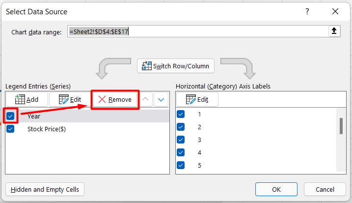
Now, with one data in the Legend Entries,  select the data, click on Edit and click OK.

Select 'Stock Price' data, click on Edit and OK
Select ‘Stock Price’ data, click on Edit and OK

This opens another dialog box called Axis Labels. In the “Axis label range:” text box, select the first column which is to be plotted on the x-axis. Select the column or enter the cell range in the text box and click OK. 

This changes the x-axis to the data we have selected. In this case, the x-axis is plotted as years.

Enter the Year data range in the label range dialog box

The selected data will appear in the Horizontal (Category) Axis Labels. Click OK. 

Click OK
Click OK

You can see the x-axis is scaled in terms of years.

The X-Axis is scaled in years

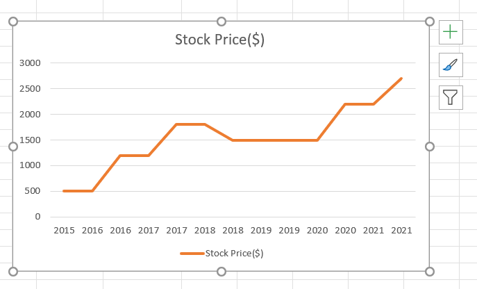
Now, you can see there are multiple duplicate values of years on the x-axis. 

To combine them, right-click on the x-axis. Select Format Axis.

Click on Format Axis

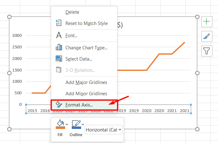
This opens up a Format Axis pane on the right side of the screen. In Axis options, under Axis Type, select Date Axis.

Change the Axis Type to Date Axis

This gives you the resultant step chart for the data.

Step chart is ready
The Step chart is ready

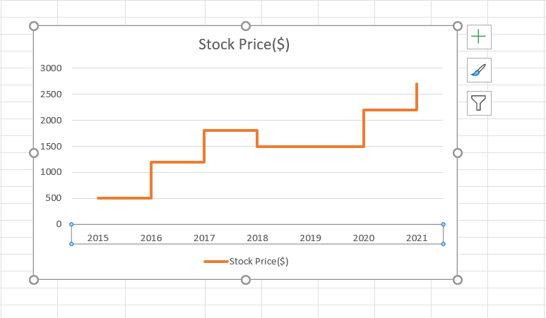
You can customize the step chart depending on your preferences. You can add any element to the chart using the Chart Element options. Change the style and colors using the Chart Styles option, and add/remove/hide any data using the Filter option.

Click on the 'Plus' symbol to add chart elements
Click on the ‘Plus’ symbol to add chart elements

For extensive customization, you can use the Chart Design or Format option from the main menu.

Use the Chart Design tab for more customization options

Suggested Reads:

How to Add Leading Zeros in Excel? 4 Easy Methods

Excel String Compare – 5 Easy Methods

How to Hide and Unhide Columns in Excel? (3 Easy Steps)

Frequently Asked Questions

What is the purpose of a step chat?

Step chart is used to showcase data which changes at certain intervals and the places where they stay constant. This chart helps track changes over a long and short intervals of time.

Can we create a step chart without time axis?

It is not necessary that a step chart should only be plotted against time. But, however, the main purpose of a step chart is to show the time intervals where the data stays constant.

Is creating a step chart complicated?

Initially as beginners, creating step charts might a little complex to understand. However, once you learn how to create a step chart they will be useful in a lot of places and once created you can use the same step chart template to create various charts.

Closing Thoughts

The step chart provides the magnitude and consistency of data, which most other charts fail to portray. 

Creating a step chart might be complex, but it will surely be effective to portray data once you understand how to convert a line chart to a step chart. 

In this guide, we saw what a step chart is and why it is useful. We also learned how to create a step chart in Excel. 

Please visit our free resources center for more high-quality Excel guides. 

Ready to take the next step and hone your skills in Excel?

Simon Sez IT has been teaching Excel for over ten years. For a low, monthly fee you can get access to 130+ IT training courses. Click here for advanced Excel courses with in-depth training modules.

Simon Calder

Chris “Simon” Calder was working as a Project Manager in IT for one of Los Angeles’ most prestigious cultural institutions, LACMA. He taught himself to use Microsoft Project from a giant textbook and hated every moment of it. Online learning was in its infancy then, but he spotted an opportunity and made an online MS Project course - the rest, as they say, is history!

Most Popular Posts

  • Kanban vs Scrum: Project Management Methodologies and Their Differences [2022]
  • How to Insert a Checkbox in Excel? 3 EASY Examples
  • How to Autofit Excel Cells? 3 Best Methods
  • XLOOKUP Google Sheets – 4 Best Alternatives!
  • Dashboards in Excel Using Pivot Tables, Pivot Charts and Slicers
  • Free Microsoft Project Training Course
  • Free Microsoft Access Tutorial for Beginners (3.5 Hours Video)
  • How to Use Blending Mode With Layers in Adobe Photoshop Elements 15

Similar Posts

How to Wrap Text in PowerPoint? 2 Easy Ways

How to Copy Bullet Format from Word to PowerPoint?

How to Use Fill Layers and Change Backgrounds in Adobe Photoshop Elements 15

An Introduction to Asana Templates – 10 Essential Categories

How to Set Up Loans in QuickBooks 2019

How to Rip a CD in Windows 8

Course Categories

  • Adobe
  • Data Analysis
  • QuickBooks
  • Microsoft
  • Web Development
  • Work Productivity

About Us

  • About Us
  • Free Resources
  • Affiliates
  • Become an Instructor

Products

  • Pricing and Plans
  • Business Pricing
  • Government Discounts
  • Non-Profit Discounts

Support

  • FAQ’s
  • Contact Us
  • DVD support

Connect

YoutubeFacebookLinkedIn
© 2023 Simon Sez IT, Inc.
  • Terms
  • Privacy Policy
  • Sitemap
888.817.6665 Monday thru Friday 7:30 a.m. - 5:00 p.m. (ET)