How to Make a Scatter Plot in Excel? 4 Easy Steps
Note: This guide on how to make a scatter plot in Excel is suitable for all Excel versions including Office 365.
In this tutorial, you will learn everything about scatter plots in Excel including how to properly use them.
You can download the sample Excel spreadsheet attached below and follow along with this guide for better understanding.
In this guide you will learn:
Related:
Bar Graph in Excel — All 4 Types Explained Easily
Easily Make a Bullet Chart in Excel—2 Examples
How to Make a Line Graph in Excel? 4 Best Line Graph Examples
What Are Scatter Plots?
Scatter plots, also known as XY charts, are a graphical representation of continuous quantitative data. You can use them to:
- Visualize the relationship between two quantitative variables.
- Compare how multiple quantities vary in comparison to one another.
Let’s say we have two variables representing ad dollars spent and sales revenue respectively. You can find the relationship between these two variables and present it in an easy to understand format using a scatter plot.
In this graph, you can see that initially, there is a surge in sales revenue corresponding to the increase in every ad dollar spent. But, after some point, it plateaus and there is diminishing marginal revenue for the increase in every ad dollar spent.
How to Make a Scatter Plot in Excel?
Making scatter plots in Excel is very easy. In fact, you can add them to your reports in a matter of few seconds if you follow the steps given below:
Step 1: Organize the Data for the Scatter Plot
As mentioned above, the scatter plot depicts the relationship between two quantitative variables. Hence, make sure that your data contains only numerical quantities.
Also, for ease of use, always list the independent variable in the left column. Then, list the dependent variable in the right column. Keep in mind that the independent variable will be plotted on the X-axis and the dependent variable will be plotted on the Y-axis.
In this example, we are studying the effect of ad dollars spent on sales revenue. Hence, the independent variable is ‘ad dollars spent’ and the dependent variable is ‘sales revenue’.
Step 2: Decide if You Want to Plot Each Variable Separately
- You can visualise the relationship between variables in two ways using the scatter plot.
- Option 1 involves plotting both the variables together in X vs Y graph style. This will look something like this:
Use this option to check for linear relationships between variables. To implement this, just select the range of the two variables.
- Option 2 involves plotting the variables separately in two different series. For this method, you will need a third column that contains a discrete categorical variable. For example, product type, months, years etc. This will look something like this:
To implement this, select the data range of the three variables (categorical, variable 1, variable 2) in that order.
Please note that you may have to plot any one variable on a secondary axis to make sense of this graph.
Step 3: Select the Type of Scatter Plot You Need
- After selecting the data range containing your variables, go to the Insert tab in the Excel ribbon.
- There, click on the Insert Scatter (X, Y) option inside the Charts group.
- Under this option, you will find 5 different scatter chart templates. Choose an appropriate chart template after previewing them by hovering over those icons.
I suggest you choose the plain ‘Scatter’ option for better clarity, especially if you have more than five data points with you.
Or if you opted to plot the two variables separately, then choose the ‘Scatter with Smooth Lines and Markers’ option.
- Experiment with the scatter chart types. You can always change the chart type by simply clicking on a different option after selecting your chart.
Also Read:
How to Superscript in Excel? (9 Best Methods)
How to Add Error Bars in Excel? 7 Best Methods
How to Indent in Excel? 3 Easy Methods
Step 4: Customize or Format the Scatter Plot
Once you have chosen a certain Scatter chart type, it will appear on your worksheet. The default formatting settings may not always suit your needs.
In the following section, I will explain some of the important details you need to alter in your scatter chart.
Add Axis Titles
Your default Scatter chart may not have axis titles inside it. To add them, click on the Chart Elements option on the top-right hand side of the chart. Under it, check Axis Titles and choose a suitable type.
.
After this, double click on the Chart titles to edit them.
Add Data Labels
Data labels are important chart elements that help your graph make more sense. To add them, click on the Chart Elements option on the top-right hand side of the chart. Under it, check Data Labels and choose More Options.
This will open the Format Data Labels pane.
Choose where and which value you want to appear as labels using the Label contains and Label position options.
Now, your scatter plot will have the necessary data labels of your choice.
Add a Trendline and its Equation
If you are using the scatter plot to test for any linear or polynomial relationships between the variables, you can add a trendline to make it more insightful.
This type of trendline is called the line of best fit or linear regression line. In a nutshell, Excel tries to find a best-fitting line or curve which is close enough to the average of all the data points in your series.
To add a trendline click on the Chart Elements option on the top-right hand side of the chart. Under it, check Data Labels and choose More Options.
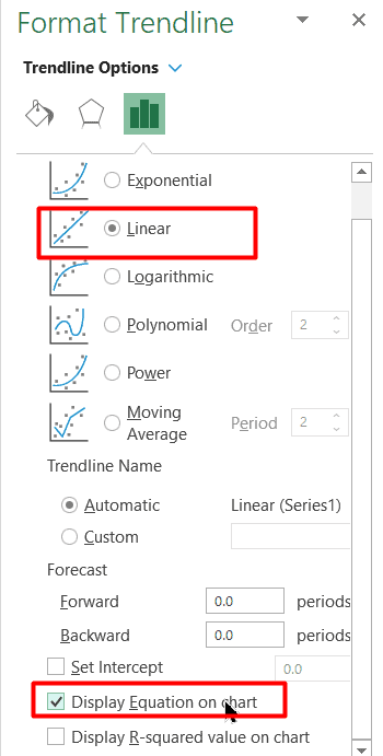
Now, in the Format Trendline pane, choose any suitable type of equation (linear, polynomial, logarithmic etc.). To display the trendline’s equation, click on the checkbox next to the Display Equation on Chart option.


The trendline along with its equation will appear in the chart.
Add Error Bars
To make your graph more informative, add Error Bars to show how much deviation exists in your scatter plot. To do this, click on a suitable Error Bars option under the Chart Elements menu.
You can learn more about error bars and how to add them here.
How to Interpret a Scatter Plot?
Scatter plots serve one main purpose. They are used to inspect the relationship between variables. Let’s see how to interpret a scatter plot and draw conclusions from it.
There are three different types of relationships that are possible.
- No Correlation – When there is no relationship between two variables.
- Positive Correlation – When there is a direct relationship between two variables.
- Negative Correlation – When there is an inverse relationship between two variables.
You can use the trendline equation and its corresponding R-squared value to find the degree of strength of this correlation.
Suggested Reads:
VLOOKUP for Dummies (or newbies)
XLOOKUP Google Sheets – 4 Best Alternatives!
5 Steps to Easily Use Excel 3D Maps (Bonus Video Included)
FAQs
How to make a scatter plot in Excel with two sets of data?
You can plot two different sets of data on a single scatter plot in Excel by clicking on the Select Data option in the Chart Design tab. Now, add the data range of your two data sets one by one, using the Add option.
How to make a scatter plot in Excel with multiple data sets?
You can add as many data sets as you want to the scatter plot in Excel. Click on Select Data and use the Add option to add as many data sets as you need, one after another. Keep in mind that you may have to plot some of them on a different scale on the y-axis if required.
Closing Thoughts
In this guide, I have walked you through how to make a scatter plot in Excel. We saw how to use which type of scatter plot and their corresponding use cases. Finally, I taught you how to format and add important elements like trendline and data labels to your chart. We also saw how to interpret a scatter plot properly.
I suggest you download the sample Excel spreadsheet and experiment with it for more hands-on experience.
If you need more high-quality Excel guides, please check out our free Excel resources centre.
Ready to dive deep into Excel? Click here for advanced Excel courses with in-depth training modules.
Simon Sez IT has been teaching Excel and other business software for over ten years. For a low, monthly fee you can get access to 100+ IT training courses.

