How to Make a Line Graph in Excel? 4 Best Line Graph Examples
Note: This guide on how to make a line graph in Excel is suitable for all Excel users including Office 365.
Line graphs are one of the most versatile graphs available in Excel. They are very popular because they are easy to plot and easy to interpret.
Line graphs’ main purpose is to help you visualize trends in your data set and understand them better.
In this guide, I’ll show you how to make a line graph in Excel with simple illustrations. I’ll also talk about how to customize a line graph to suit your needs.
Related:
How To Find Duplicates In Excel? The Best Guide
Excel Goal Seek—the Easiest Guide (3 Examples)
Create A Pivot Table In Excel—the Easiest Guide
You’ll learn:
- Line Graphs – An Overview
- Excel Line Chart Types
- How to Make a Line Graph in Excel?
- Best Line Graph Examples
- How to Customize a Line Graph in Excel?
Line Graphs – An Overview
A line graph is nothing but a graphical line, which connects a series of data points from the data set. It is usually used to represent a change in quantity over a period of time.
Generally, the X-axis contains the independent variables like time or date intervals, and the Y-axis contains continuous dependent variables like sales, profit, prices etc.
The idea here is that the slope of these lines shows the general trends in the data. A positive slope signifies an increase in value and a negative slope indicates a decrease in value.
A good example of when to use a line graph is plotting graphs to track changes and trends in a data set over time. A line graph is also best suited to compare how multiple variables change over time and detect any relationship between them.
Keep in mind that line graphs can become clumsy with very large datasets and are not suitable for discrete data variables.
Excel Line Chart Types
Microsoft Excel offers the following types of line charts.
Line: It is the simplest form of the line chart in Excel. The number of columns of data in your selection determines whether to plot a single line chart or multiple line chart.
Stacked Line Chart: The lines in this chart are cumulative, meaning that each higher line includes the lower line’s values. It is used to show how the compositions of the parts of a whole change over time.
100% Stacked Line Chart: This chart is similar to the stacked line chart, except that it uses percentages to compare the parts of the whole, instead of an absolute value.
Line Graph with Markers: This is just a line graph with additional markers for each data point. It makes visualisation and analysis easier.
3-D Line Chart: This is a variation of the basic 2-D line chart, except here the plotted lines are in 3D.
How to Make a Line Graph in Excel?
Now, I’ll demonstrate the steps involved in creating an excel line graph.
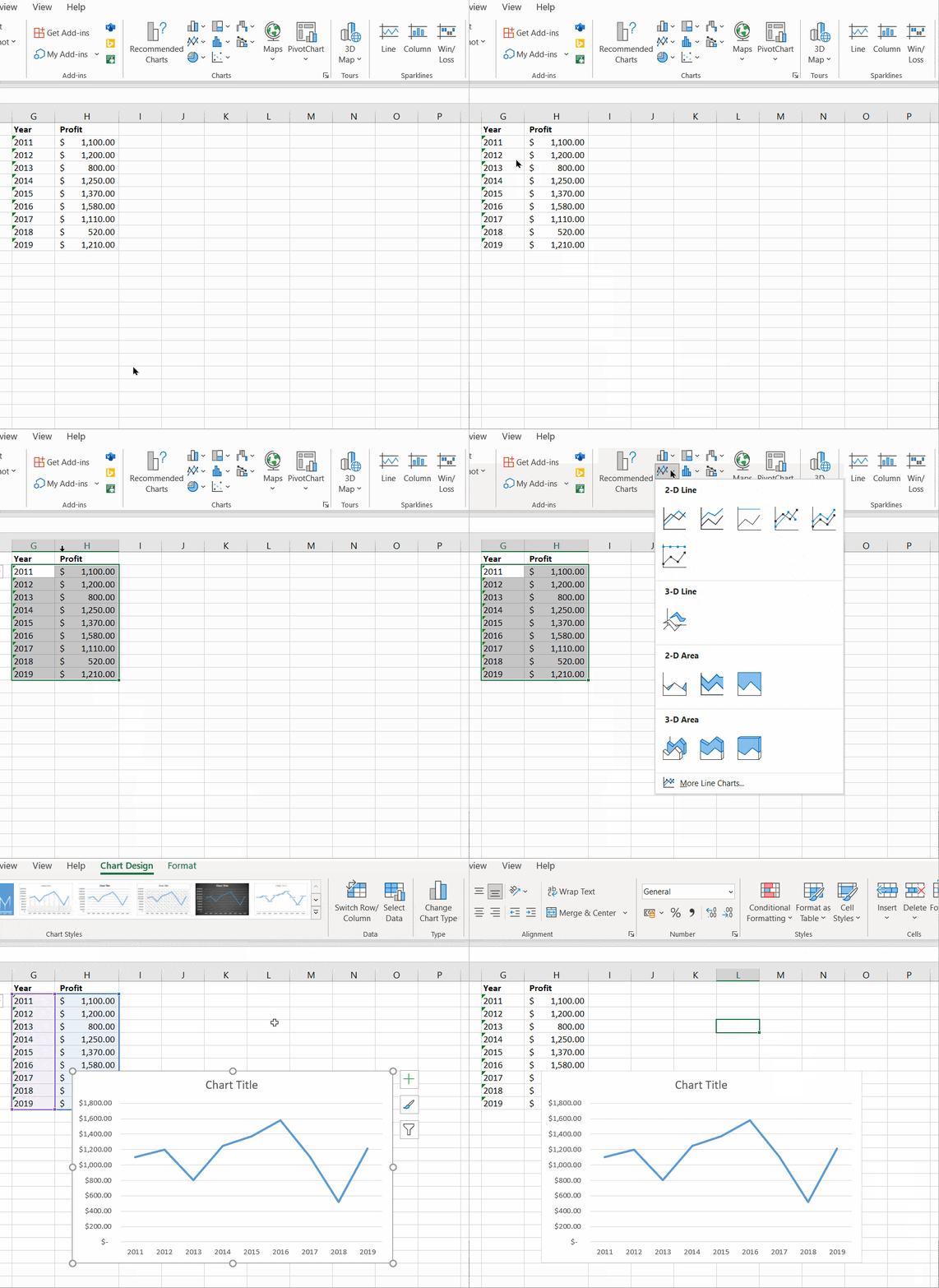
Step 1: Get your data ready. It should have at least two columns of data. The independent variable (time) should come first, followed by the dependent variable.


In this example, I am going to track the profits over the years. Hence, it has two columns.
Step 2: Select your data and click on the 2-D Line Graph button. It can be found in Insert Tab > Charts group > Insert Line or Area Chart > Line Chart.
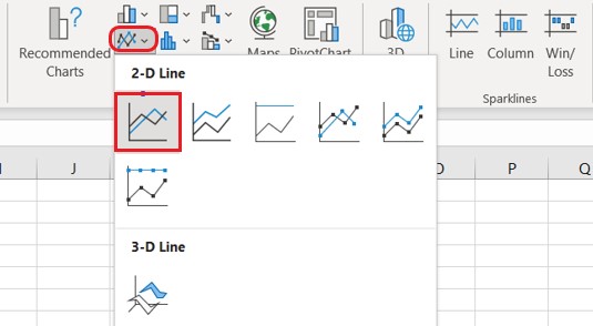

You can choose any of these available 2-D graph types. In this example, I am choosing the 2-D Line graph option.
Step 3: That’s all it takes to plot a line graph in Excel. Your line graph is ready now. But, customize it, if needed. I’ll teach you how to do this later in this same article.

Also Read:
How To Use Excel Countifs: The Best Guide
Excel Conditional Formatting -the Best Guide (Bonus Video)
The Best Excel Project Management Template In 2021
Best Line Graph Examples
Before I explain how to customize these line charts, it is important to know about all the types of line graphs in Excel. Let me show some of the best line graph examples, to help you appreciate their use cases better.
How to Graph Multiple Lines in Excel?
Let’s suppose you have two different product lines in your organisation. Now, you want to compare the profits for these two product lines over the years.
To do this, using multiple line graphs, follow these steps:
Step 1: Set your data in order. Keep in mind that, your data should contain at least three columns of data. One independent variable (time) and two series of dependent variables.
Step 2: Select your data and click on the 2-D Line Graph button. It can be found in Insert Tab > Charts group > Insert Line or Area Chart > Line Chart.


Step 3: Your multiple line graph is ready now. Edit or customize it if needed.


How to Plot a Stacked Line Graph in Excel?
Stacked line graphs will show you how parts of a whole variable change over time. Let’s say you have three product lines in your organisation. You want to find how each product line’s contribution to the total profit changes over time.
To do this using stacked line graphs, follow these steps.
Step 1: Get your data ready. It should contain at least 3 columns of data. One independent variable (time) and two series of dependent variables.


Step 2: Select your data and click on the Stacked Line Graph button. It can be found in Insert Tab > Charts group > Insert Line or Area Chart > Stacked Line
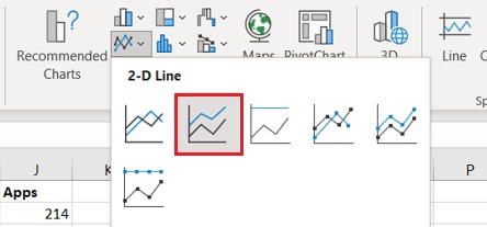

Step 3: Your stacked line graph is ready now. Edit or customize it if needed.


The lines in the stacked line graph are cumulative, i.e. each data series is added to the previous data series. The topmost data line is the sum of all the data lines below. Hence, their data lines will never cross each other, like they do in a normal line chart.
How to Plot a 100% Stacked Line Graph in Excel?
100% Stacked line graphs are similar to stacked line graphs. But, they will show you how parts of a whole variable change over time in percentages rather than absolute values.
Let’s say you have three product lines in your organisation. You want to find how much cumulative percentage of each product line’s contribution to the total profit changes over time.
To do this using 100% stacked line graphs, follow these steps.
Step 1: Get your data ready. It should contain at least 3 columns of data. One independent variable (time) and two series of dependent variables.
Step 2: Select your data and click on the 2-D 100% Stacked Line Graph button. It can be found in Insert Tab > Charts group > Insert Line or Area Chart > 100% Stacked Line
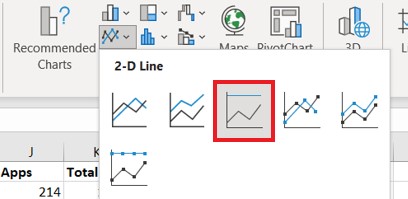

Step 3: The 100% stacked line graph is ready now. Edit or customize it if needed.


The lines in the 100% stacked line graph are cumulative, i.e. percentage contribution of each data series is added to the previous data series.
Hence, the top most data line is the sum of all the percentages of the data lines below and will always be 100%. Hence, the data lines will never cross each other, like they do in a normal line chart.
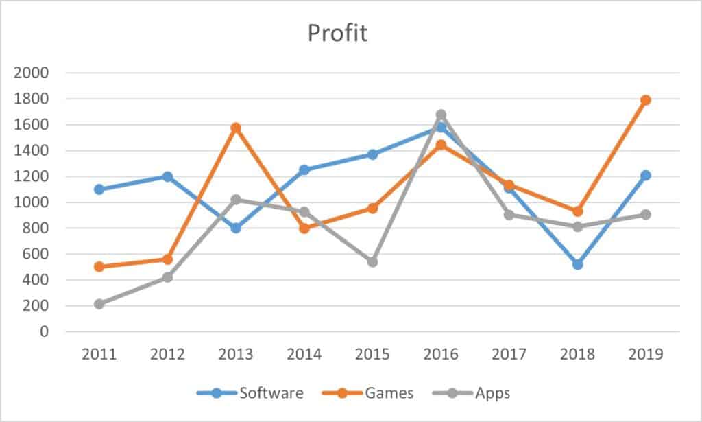
How to Plot a Line Graph with Markers?
You can add makers to your line graphs to make them more presentable. To do this select any of these: Line with Markers, or Stacked Line with Markers or 100% Stacked Line with Markers under the Line chart drop-down menu.

How to Customize a Line Graph in Excel?
Sometimes, customizing the line graphs is required before presenting them to others.
Here, I’ll show you how to edit the following major features of an Excel line graph.
- Add Titles to a Line Graph in Excel
- Hide or Move Chart Legend
- Show or Hide Gridlines
- Hide or Delete Lines in the Excel Line Graph
- Change Line Type and Color
Add Chart Titles to a Line Graph in Excel
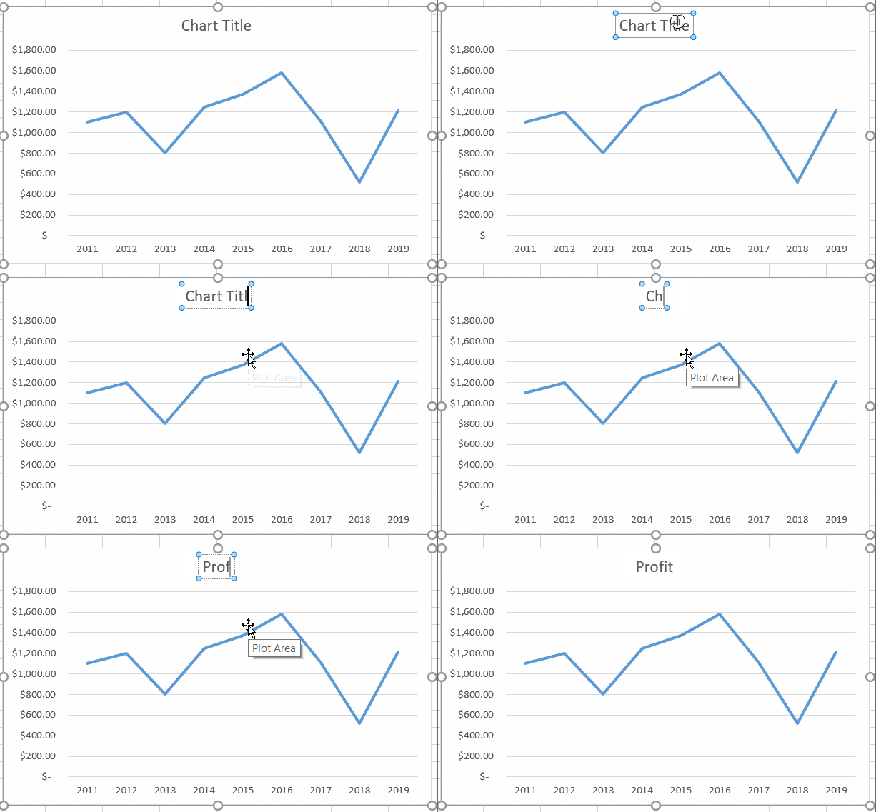
To add titles to an Excel line graph, just double click on the already existing default title. This will enable the option to edit it. Now, you can set your custom title with any font style to your line chart.

Hide or Move Chart Legend in a Line Graph.
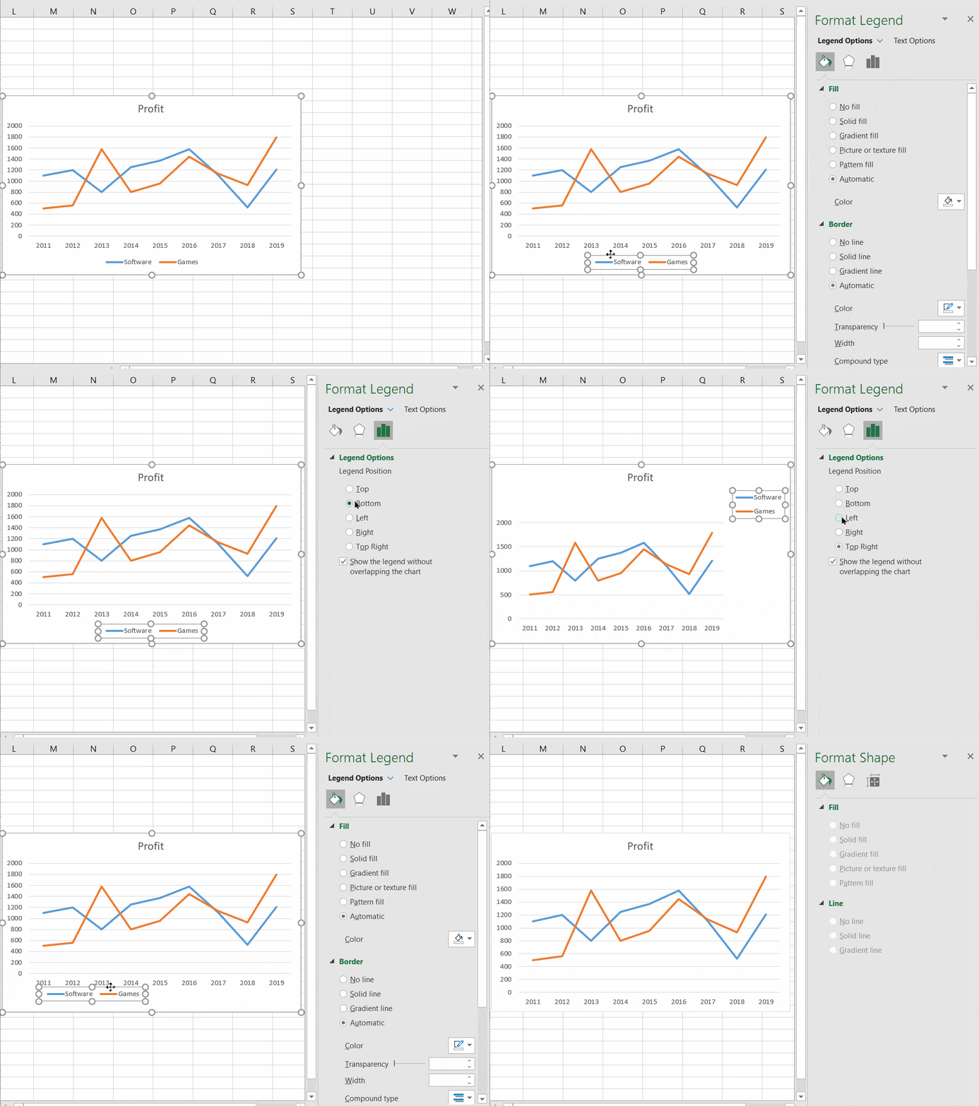
To hide or move the chart legend, double click on the existing chart legend. This will open up the Format Legend pane on the right side.
In the Format Legend pane, under Legend Options, you can change the position of the legend. It is also possible to manually change the position by dragging it anywhere on the chart.
To delete the legend, just select it and press Delete.

Show or Hide Gridlines
To hide or unhide the gridlines just click on the “Plus” icon next to the chart to open the Chart Elements toggle menu.
Here, you can switch on or off any of these chart elements.
To hide the gridlines just uncheck the tickbox next to the Gridlines option.


Hide or Delete Lines in the Excel Line Graph
To hide a line temporarily, you can simply hide the original data column which is represented by the line. Do this by selecting the entire column, right-clicking on it and selecting Hide.
The line will appear again once you unhide the column.
Another method to hide data lines temporarily is to click on the Chart Filters option next to the chart and deselect the data series which are not needed.
To permanently delete a data line from your graph, right-click on the unwanted line and click delete.
Change Line Type and Color
To change the line type or colour of a line, double click it to open the Format Data Series pane.
In the Format Data Series pane, under the Fill & Line section change the line colour using the Color Picker and change the line type using the Dash Type options.
Suggested Reads:
Create An Excel Dashboard In 5 Minutes – The Best Guide
Dynamic Dropdown Lists In Excel – Top Data Validation Guide
Predict Future Values Using Excel Forecast Sheet – The Best Guide
FAQs
What are line charts best used for in Excel?
A line chart is best suited for tracking the changes and trends in the data over a period of time.
How do you plot multiple lines in Excel?
The easiest way to plot multiple lines in Excel is to use the simple 2-D line chart. Select the data range, including the multiple columns of data and click on the 2-D Line Chart. Now, Excel will plot these multiple columns of data as multiple lines.
Let’s Wrapup
In this guide, I have explained how to make a line graph in Excel in simple steps. We also saw four important examples of the various line graph types. If you have any doubts regarding Excel line graphs or any other Excel feature, please let us know in the comments below.
If you need more high-quality Excel guides, please check out our free Excel resources centre.
Simon Sez IT has been teaching Excel for over ten years. For a low, monthly fee you can get access to 100+ IT training courses. Click here for advanced Excel courses with in-depth training modules.

