Simon Sez IT

Online software training and video tutorials for Microsoft, Adobe & more

  • Course List
    • Adobe
      • Dreamweaver
        • Dreamweaver CC
        • Dreamweaver CS6
        • Dreamweaver CS5
        • Dreamweaver CS4
      • Flash
        • Flash CS5
      • InDesign
        • InDesign CS6
        • InDesign CS5
      • Photoshop
        • Photoshop CS6
        • Photoshop CS5
        • Adobe Photoshop CS4
      • Photoshop Elements
        • Photoshop Elements 2022
        • Photoshop Elements 2019
        • Photoshop Elements 2018
        • Photoshop Elements 15
        • Photoshop Elements 14
        • Photoshop Elements 13
        • Photoshop Elements 12
        • Photoshop Elements 11
        • Photoshop Elements 10
        • Photoshop Elements 9
        • Photoshop Elements 8
    • Microsoft
      • Access
        • Access 2021
        • Access 2019
        • Access 2019 Advanced
        • Access 2016
        • Access 2016 Advanced
        • Access 2013
        • Access 2013 Advanced
        • Access 2010
        • Access 2010 Advanced
        • Access 2007
      • Excel
        • Data Analytics in Excel
        • Excel 2021 Advanced
        • Excel 2021 Intermediate
        • Excel 2021 Beginners
        • PivotTables for Beginners
        • Excel Dashboards
        • Advanced Formulas in Excel
        • Excel for Business Analysts
        • Advanced PivotTables
        • Power Pivot, Power Query and DAX in Excel
        • Excel 2019 Beginners (Mac)
        • Excel 2019 Beginners
        • Excel 2019 Advanced
        • Excel 2016 Beginners
        • Excel 2016 Intermediate
        • Excel 2016 Advanced
        • Excel 2013
        • Excel 2013 Advanced
        • Excel 2010 Beginners
        • Excel 2010 Advanced
        • Excel 2007
      • OneNote
        • OneNote Desktop and Windows 10
        • OneNote 2016
      • Outlook
        • Outlook 2021
        • Outlook 2019
        • Outlook 2016
        • Outlook 2013
        • Outlook 2010
        • Outlook 2007
      • Power Automate
        • Introduction to Power Automate
      • Power BI
        • Power BI
        • Power BI Intermediate
      • PowerPoint
        • PowerPoint 2021
        • PowerPoint 2019
        • PowerPoint 2016
        • PowerPoint 2013
        • PowerPoint 2010
        • PowerPoint 2007
      • Project
        • Project 2021
        • Project for the Web
        • Project 2019
        • Project 2019 Advanced
        • Project 2016
        • Project 2016 Advanced
        • Project 2013
        • Project 2013 Advanced
        • Project 2010
        • Project 2010 Advanced
      • Publisher
        • Publisher 2013
      • SharePoint
        • SharePoint Online
        • SharePoint Foundation 2013
        • SharePoint Server 2013
        • SharePoint Foundation 2010
      • Teams
        • Microsoft Teams
      • VBA
        • Macros and VBA for Beginners
        • VBA for Excel
        • VBA Intermediate Training
      • Visio
        • Microsoft Visio 2019
        • Visio 2016
        • Visio 2013
        • Microsoft Visio 2010
      • Windows
        • Windows 11
        • Windows 10 (2020 Update)
        • Windows 10
        • Windows 8
        • Windows 7
        • Windows Vista
      • Word
        • Word 2021
        • Word 2019 Advanced
        • Word 2019
        • Word 2016
        • Word 2013
        • Word 2010
        • Word 2007
    • QuickBooks
      • QuickBooks
        • QuickBooks Desktop Pro 2022
        • QuickBooks Pro 2021
        • QuickBooks Online Advanced
        • QuickBooks Online
        • QuickBooks Canada
        • QuickBooks Pro 2020
        • QuickBooks 2019
        • QuickBooks 2018
        • QuickBooks Pro 2017
        • QuickBooks Pro 2016
        • QuickBooks Pro 2015
        • QuickBooks Pro 2014
        • QuickBooks Pro 2013
        • QuickBooks Pro 2012
        • QuickBooks Pro 2011
        • QuickBooks Pro 2010
        • QuickBooks Pro 2009
    • Web Development
      • AngularJs
        • AngularJS Crash Course
      • Dreamweaver
        • Dreamweaver CC
        • Dreamweaver CS6
        • Dreamweaver CS5
        • Dreamweaver CS4
      • Bootstrap
        • Bootstrap Framework
      • Html/CSS
        • HTML/CSS Crash Course
        • HTML5 Essentials
      • Python
        • Python Object-Oriented Programming
        • Pandas for Beginners
        • Introduction to Python
      • Java
        • Java for Beginners
      • JavaScript
        • JavaScript for Beginners
        • jQuery Crash Course
      • MySql
        • MySQL for Beginners
      • PHP
        • PHP for Beginners
        • Advanced PHP Programming
      • XML
        • XML Crash Course
    • Data Analysis
      • Financial Modeling
        • Financial Risk Management
        • Financial Forecasting and Modeling
      • Alteryx
        • Alteryx Advanced
        • Introduction to Alteryx
      • Power BI
        • Power BI Intermediate
        • Power BI
      • Qlik Sense
        • Qlik Sense Advanced
        • Qlik Sense
      • R Programming
        • R Programming
      • Tableau
        • Tableau Desktop Advanced
        • Tableau Desktop
      • Python
        • Python Object-Oriented Programming
        • Pandas for Beginners
        • Introduction to Python
    • Work Productivity
      • Google Sheets
        • Google Sheets for Beginners
      • Confluence
        • Introduction to Confluence
      • Monday
        • Getting Started in Monday.com
      • Asana
        • Asana for Employees and Managers
        • Introduction to Asana
      • Jira
        • Getting Started in Jira
  • For Business
  • About Us
    • Testimonials
    • Contact Us
    • FAQ
    • Membership
    • About Us
  • Pricing
  • Free Resources
  • Sign In
  • Get Started
Home > Microsoft Excel > How to Make a Pie Chart in Excel? A Step by Step Guide

How to Make a Pie Chart in Excel? A Step by Step Guide

(Note: This guide on how to make a pie chart in Excel is suitable for all Excel versions including Office 365)

Visual representations like graphs and charts are an amazing and innovative way to educate people on very intricate details. They help denote details in a simpler and easily understandable manner, which would be confusing using words. There are a variety of non-verbal methods to present data. Among them, the most popular form of visual representation is the pie chart.

The pie chart represents each data as a slice of the pie based on the percentage data. They are mostly used to denote individual amounts from a group.

You might be wondering how we deal with complicated data in Excel. Representing it in the form of a pie chart is more efficient. The good news is you can easily represent your data in the form of pie charts in Excel.

In this article, I will show you how to make a pie chart in Excel and customize them easily.

You’ll Learn:

  • How to Make a Pie Chart in Excel?
  • How to Customize a Pie Chart in Excel?
    • Using Customize Shortcuts in the Pie Chart
    • Using Design and Format option in the Main Menu

Watch our video on how to make pie charts in Excel

Related:

How to Create an Excel Map Chart from Pivot Table Data? 3 Simple Steps

How to Create an Excel Heat Map? 5 Simple Steps

Create an Excel Dashboard in 5 Minutes – The Best Guide

How to Make a Pie Chart in Excel?

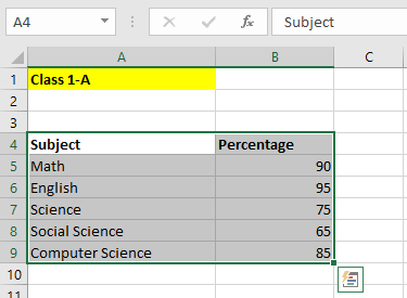
Consider a class, 1-A of 50 students who have just finished their exams. Among them, 90% scored a perfect score in Math. 75% of the students scored 100 in Science and 95% scored the same in English. Also, 65% and 85% of the students have a perfect score in Social Science and Computer Science respectively. 

In this example, we have the values on individual rows. Excel has the ability to identify values even if they are represented on individual columns. 

Table containing Subjects and Percentage

Reading through the text is quite confusing right, especially when there is a large amount of data. Let us see how to make a pie chart in Excel for the given data.

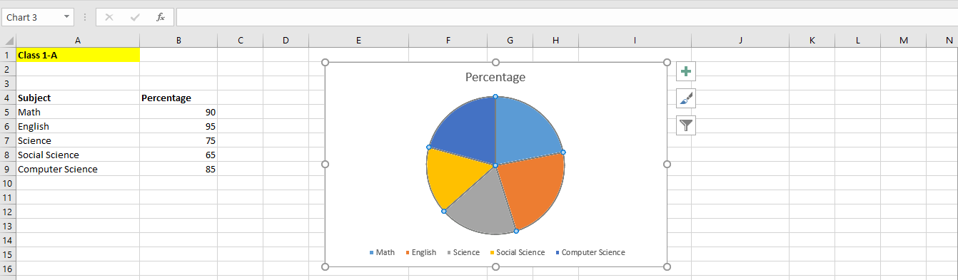
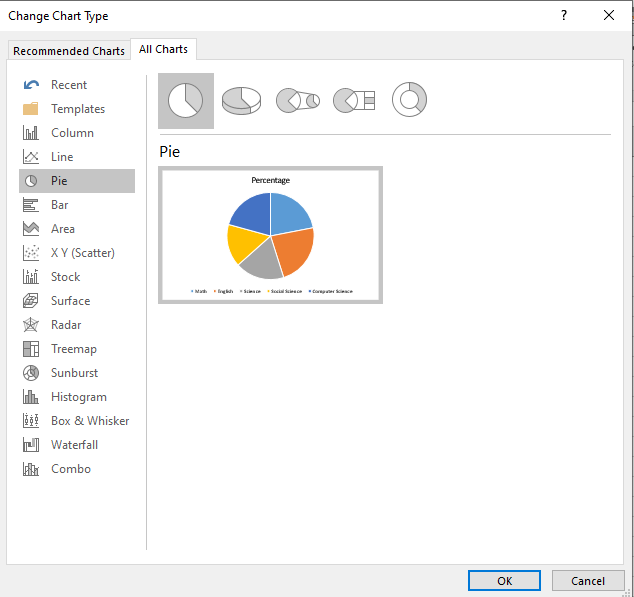
First, select the data you are using for the pie chart. If you have only one table, you can straightaway click on the pie chart option and a pie chart will be created with all the elements/data in the table. 

Select the table
Select the table

Go to Insert > Charts and select the pie chart option. You can choose between different pie charts from the dropdown.

How to make a pie chart in Excel

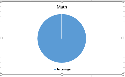
Click on the pie chart of your choice. The chart gets added in the center of the sheet. You can move or resize the chart and place it wherever you want.

Pie chart representing the data in the table

That is all. Creating a pie chart in Excel is so simple. Now, you can easily portray complex numeric data in an easily understandable form. 

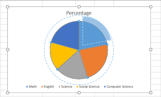
Note: You can also give an in-depth representation of any segment. Simply click on the chart, select the area you want to highlight, and drag the area a little out to the pie chart. This pops up the selected area and helps put more focus and depth on it.

Highlight a single data from the pie chart

Also Read:

How to Freeze Rows in Excel? 4 Easy Steps

How to Sort Dates in Excel? 6 Easy Methods

How to Filter in Excel? A Step-by-Step Guide

How to Customize a Pie Chart in Excel?

Clicking on the pie chart creates a default design for the fields with default colors and font. However, Excel offers you the liberty to customize your pie chart to your preferences. You can change the colors, font, style, and fields to your liking. 

There are 2 ways to customize your pie chart.

Using Customize Shortcuts in the Pie Chart

The first way is to customize the pie chart directly by clicking on the pie chart. This shows three icons towards the right of the chart. They provide important options to customize your pie chart.

Shortcuts to customize the pie chart

The first element is called Chart Elements. This helps you customize the text in the chart. You can change the position of the chart title, add or change the position of the labels, and choose the position for the legends to appear.

Chart elements shortcut

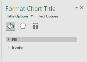
In every Chart Element, there is an option called “More Options”. Clicking this opens up a Format Chart Title pop-up which provides you in-depth additional customizing options to the chart.

Format Chart Title
Format Chart Title

The second element is the Style and Color options. This helps you change the background layout and color of the areas within the pie chart. Customizing the colors and background helps in providing an appealing look to the chart and makes it easier to present them.

Style and Color option

The final element to customize your pie chart is the Filter option. This helps you to choose which elements to show on the pie chart. 

Filter option
Filter option

Using Design and Format Options in the Main Menu

The other method to customize a pie chart offers extensive customization to your chart. You can do this by using the Design option in the main menu.

Click on the pie chart and click on the Design option from the main menu.

Customize using Design menu

This opens up multiple options to customize your pie chart. I’ll explain the functionality of the fields one by one.

The first two options under the chart layout are very similar to the chart elements option in the customize shortcut. Here, you can select the layout, add or move texts, and alter the position of the fields.

Chart layout options

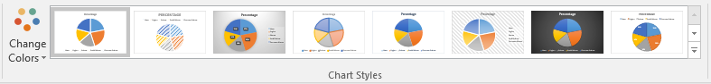
The chart styles option is used to change the colors and choose the background layout of the pie chart.

Chart styles option
Chart styles option

Under the data section, there are two options.

Customize the data option

The first option switch row/column swaps data plotted on the X-axis to move to Y-axis. That is it helps you to switch between the rows and columns of your table. 

Switch between row and column

The second option select data is similar to the filter option in the customize shortcut option. You can add, edit, and remove the fields based on your preferences.

Select data and filter option

In case the pie chart is not the most feasible option for your data, you can also choose other chart types to create your charts based on the data.

Change chart type
Change chart type

In case you have to move a chart because it is hiding the other contents, or you need to move the content to another sheet in Excel, you can use the move chart option.

Move chart
Move chart

The Format option in the main menu also helps you customize your chart to your preferences

Customize pie chart using Format option

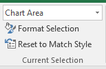
The first option is used to select the area for editing. Click on the dropdown and select the area you want to edit. Then you can resize and edit the selected area.

Select the area to customize

The shape styles option is used to change the background color of the chart. Also, you can change the border color and set shadows on the chart. 

Shape and style option

The WordArt option is used to change the font and color of the heading or legend texts inside the pie chart. 

Customize font using Wordart styles

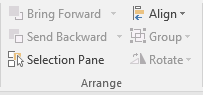
The arrange option is used to change the visibility and order of your pie charts. The bring forward, send backward, align and selection pane help you to structure, move and arrange the pie chart. (Frogbones)

Arrange pie chart option

Finally, using the size option, you can set the accurate dimensions for the dimensions of the chart.

Change size of the pie chart

Suggested Reads:

How to Group in Pivot Table? ( 2 Easy Methods)

How to Use the Excel IFS Function? – 2 Easy Examples

How to Remove Hyperlinks in Excel? 3 Easy Methods

Closing Thoughts

Pie charts can be effective communication tools to help the audience understand complex data. Also, they provide a real-time comparison of the data points in an intuitive manner.

In this guide, we saw how to make a pie chart in Excel. We also showed you how to customize it based on your preferences. If you have any questions, please let us know in the comments.

If you need more high-quality Excel guides, please check out our free Excel resources center.

Simon Sez IT has been teaching Excel for over ten years. For a low, monthly fee you can get access to 130+ IT training courses. Click here for advanced Excel courses with in-depth training modules.

Simon Calder

Chris “Simon” Calder was working as a Project Manager in IT for one of Los Angeles’ most prestigious cultural institutions, LACMA. He taught himself to use Microsoft Project from a giant textbook and hated every moment of it. Online learning was in its infancy then, but he spotted an opportunity and made an online MS Project course - the rest, as they say, is history!

Most Popular Posts

  • Kanban vs Scrum: Project Management Methodologies and Their Differences [2022]
  • How to Insert a Checkbox in Excel? 3 EASY Examples
  • How to Autofit Excel Cells? 3 Best Methods
  • XLOOKUP Google Sheets – 4 Best Alternatives!
  • Dashboards in Excel Using Pivot Tables, Pivot Charts and Slicers
  • Free Microsoft Project Training Course
  • Free Microsoft Access Tutorial for Beginners (3.5 Hours Video)
  • How to Use Blending Mode With Layers in Adobe Photoshop Elements 15

Similar Posts

Create Purchase Orders in QuickBooks 2019

A Guide to Jira Issue Types [2022]

Advanced Formulas in Excel – 1 Hour Recorded Webinar

Microsoft Project 2019: Linking Tasks and Dependencies

How to Create a Monday Gantt Chart? – 8 Effective Steps

Inserting, Reordering, Renaming and Deleting Pages in Publisher 2013

Course Categories

  • Adobe
  • Data Analysis
  • QuickBooks
  • Microsoft
  • Web Development
  • Work Productivity

About Us

  • About Us
  • Free Resources
  • Affiliates
  • Become an Instructor

Products

  • Pricing and Plans
  • Business Pricing
  • Government Discounts
  • Non-Profit Discounts

Support

  • FAQ’s
  • Contact Us
  • DVD support

Connect

YoutubeFacebookLinkedIn
© 2023 Simon Sez IT, Inc.
  • Terms
  • Privacy Policy
  • Sitemap
888.817.6665 Monday thru Friday 7:30 a.m. - 5:00 p.m. (ET)