
How to Create an Excel Heat Map? 5 Simple Steps
(Note: This tutorial on Excel heat map is suitable for all Excel versions including Office 365)
In Excel, charts and graphs are widely used to present data in an easy to understand and visually intuitive format. The heat map is one such very popular data presentation tool in Excel.
In this guide, I’ll show you how to create an Excel heat map from scratch the easy way.
You’ll learn:
You can watch this short video to easily understand how to create a heat map in Excel.
What is an Excel Heat Map?
A heat map is actually a colour coded table. It conveys a lot of information easily by combining a normal table with a colour palette. I am sure, most of us would have come across heat maps in our daily lives. They are used in reports to draw attention to certain data points and explain them easily.
Heat maps in Excel, use colours to differentiate data, thus helping you give a bird’s eye view of what’s happening.
The value in each cell of an Excel heat map has a colour and it conveys some meaning. It usually ranges from dark to light colour and represents the weightage of the value in the cell.
In the next section, let us see how to create a heat map in Excel, using conditional formatting. We’ll also see how to create a dynamic heat map that updates itself when new rows or columns of data are added.
Let’s get started.
Related:
Easily Make a Bullet Chart in Excel—2 Examples
Creating a Dynamic Pivot Chart Title Based on Slicer(6 Easy Steps)
How to Make a Line Graph in Excel? 4 Best Line Graph Examples
How to Create a Heat Map in Excel Using Conditional Formatting
You can technically create a heat map in Excel, by manually changing the colour of each cell as we add data to the table. But, this is a static method, since the colour will not change if there is any variation in the data.
Instead, we can use conditional formatting to highlight the cells based on their values. It changes the colour in the cell automatically when new data is included or already present data is changed.
Let us see how to do this in Excel:
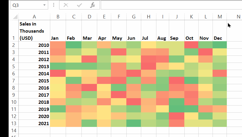
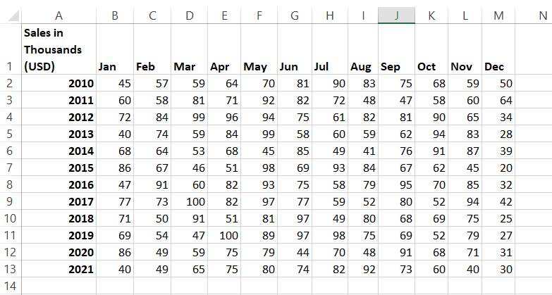
Step 1: Enter the Source Data
Enter your source data, in the normal format. This will act as the base of your heat map. Ensure that all the rows and columns of your source data are properly labelled to avoid confusion.
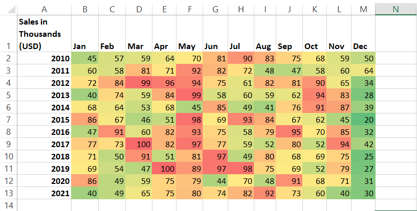
Step 2: Apply Conditional Formatting
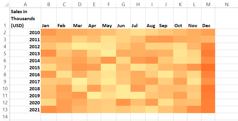
Select the range of cells (source data) where you wish to apply the heat map. Then, go to Home > Conditional Formatting > Color Scales and pick any suitable colour scale.

In this example, the Red – Yellow – Green colour scale applies green colour to lower values and red to higher values. Anything in between will get a shade of yellow mixed with green and red. . There is a gradient with different shades for the 3 colours.
Also Read:
Bar Graph in Excel — All 4 Types Explained Easily (Excel Sheet Included)
How to Make a Scatter Plot in Excel? 4 Easy Steps
How to Add Error Bars in Excel? 7 Best Methods
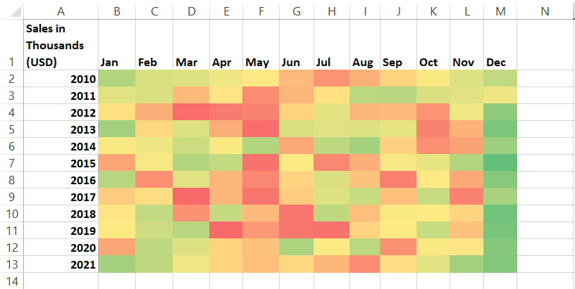
Step 3: Hide the Numbers
If you don’t want the numbers to appear in your heat map, select the numbers and press the Ctrl+1 shortcut to open the Format cells dialog box. There, go to the Custom category of the Number tab. Now, type the code: ;;; in the text box and click OK.

Congratulations! You have successfully created a heat map in Excel.
Step 4: Use a Single Color Gradient in Heat Map (Optional)
Sometimes, you don’t want a multi-colour heat map and instead want a single colour to be highlighted for all the lower values, for the sake of simplicity.
To do this, go to Home > Conditional Formatting > Color Scales > More Options.

In the New Formatting Rule box, select ‘2-Color scale’ from the Format Style dropbox.
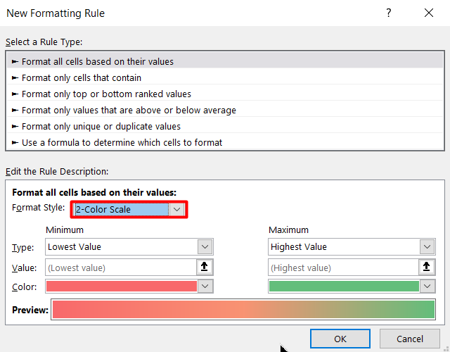
Now, set any single colour’s lighter and darker hues in the Minimum and Maximum color pickers, as per your requirements.

That’s all. Click OK, to view your single colour gradient heat map.
Step 5: Format your Heat Map into a Table
An Excel heat map is dynamic by default since it reads the cell values and changes colour accordingly. But, if you notice carefully, it will not update itself, if new rows of data are added.
To make it truly dynamic, format your entire data as a table. You can easily do this, by selecting the entire heat map (including the headers) and using the Ctrl+T shortcut. This way, your heat map will update automatically, if newer rows of data are inserted.

Suggested Reads:
How to Add a Watermark in Excel? 2 Easy Methods
How to Remove Hyperlinks in Excel? 3 Easy Methods
How to Use the Format Painter Excel Feature? — 3 Bonus Tips
Let’s Wrap Up
In this article, we learned how to create a heat map using conditional formatting, in five simple steps. We hope you find this guide helpful. I recommend you test this out, in a practice sheet to gain a better understanding.
Please feel free to ask any questions in the comments section. We are always happy to help.
If you need more high-quality Excel guides, please check out our free Excel resources centre.
Ready to dive deep into Excel? Simon Sez IT has been teaching Excel for over ten years. For a low, monthly fee you can get access to 100+ IT training courses. Click here for advanced Excel courses with in-depth training modules.
Simon Calder
Chris “Simon” Calder was working as a Project Manager in IT for one of Los Angeles’ most prestigious cultural institutions, LACMA.He taught himself to use Microsoft Project from a giant textbook and hated every moment of it. Online learning was in its infancy then, but he spotted an opportunity and made an online MS Project course - the rest, as they say, is history!
