Simon Sez IT

Online software training and video tutorials for Microsoft, Adobe & more

  • Course List
    • Adobe
      • Dreamweaver
        • Dreamweaver CC
        • Dreamweaver CS6
        • Dreamweaver CS5
        • Dreamweaver CS4
      • Flash
        • Flash CS5
      • InDesign
        • InDesign CS6
        • InDesign CS5
      • Photoshop
        • Photoshop CS6
        • Photoshop CS5
        • Adobe Photoshop CS4
      • Photoshop Elements
        • Photoshop Elements 2022
        • Photoshop Elements 2019
        • Photoshop Elements 2018
        • Photoshop Elements 15
        • Photoshop Elements 14
        • Photoshop Elements 13
        • Photoshop Elements 12
        • Photoshop Elements 11
        • Photoshop Elements 10
        • Photoshop Elements 9
        • Photoshop Elements 8
    • Microsoft
      • Access
        • Access 2019
        • Access 2019 Advanced
        • Access 2016
        • Access 2016 Advanced
        • Access 2013
        • Access 2013 Advanced
        • Access 2010
        • Access 2010 Advanced
        • Access 2007
      • Excel
        • Excel 2021 Advanced
        • Excel 2021 Intermediate
        • Excel 2021 Beginners
        • PivotTables for Beginners
        • Excel Dashboards
        • Advanced Formulas in Excel
        • Excel for Business Analysts
        • Advanced PivotTables
        • Power Pivot, Power Query and DAX in Excel
        • Excel 2019 Beginners (Mac)
        • Excel 2019 Beginners
        • Excel 2019 Advanced
        • Excel 2016 Beginners
        • Excel 2016 Intermediate
        • Excel 2016 Advanced
        • Excel 2013
        • Excel 2013 Advanced
        • Excel 2010 Beginners
        • Excel 2010 Advanced
        • Excel 2007
      • OneNote
        • OneNote Desktop and Windows 10
        • OneNote 2016
      • Outlook
        • Outlook 2019
        • Outlook 2016
        • Outlook 2013
        • Outlook 2010
        • Outlook 2007
      • Power Automate
        • Introduction to Power Automate
      • PowerPoint
        • PowerPoint 2021
        • PowerPoint 2019
        • PowerPoint 2016
        • PowerPoint 2013
        • PowerPoint 2010
        • PowerPoint 2007
      • Project
        • Project 2019
        • Project 2019 Advanced
        • Project 2016
        • Project 2016 Advanced
        • Project 2013
        • Project 2013 Advanced
        • Project 2010
        • Project 2010 Advanced
      • Publisher
        • Publisher 2013
      • SharePoint
        • SharePoint Online
        • SharePoint Foundation 2013
        • SharePoint Server 2013
        • SharePoint Foundation 2010
      • Teams
        • Microsoft Teams
      • VBA
        • Macros and VBA for Beginners
        • VBA for Excel
        • VBA Intermediate Training
      • Visio
        • Microsoft Visio 2019
        • Visio 2016
        • Visio 2013
        • Microsoft Visio 2010
      • Windows
        • Windows 11
        • Windows 10 (2020 Update)
        • Windows 10
        • Windows 8
        • Windows 7
        • Windows Vista
      • Word
        • Word 2019 Advanced
        • Word 2019
        • Word 2016
        • Word 2013
        • Word 2010
        • Word 2007
    • QuickBooks
      • QuickBooks
        • QuickBooks Pro 2021
        • QuickBooks Online Advanced
        • QuickBooks Online
        • QuickBooks Canada
        • QuickBooks Pro 2020
        • QuickBooks 2019
        • QuickBooks 2018
        • QuickBooks Pro 2017
        • QuickBooks Pro 2016
        • QuickBooks Pro 2015
        • QuickBooks Pro 2014
        • QuickBooks Pro 2013
        • QuickBooks Pro 2012
        • QuickBooks Pro 2011
        • QuickBooks Pro 2010
        • QuickBooks Pro 2009
    • Web Development
      • AngularJs
        • AngularJS Crash Course
      • Dreamweaver
        • Dreamweaver CC
        • Dreamweaver CS6
        • Dreamweaver CS5
        • Dreamweaver CS4
      • Bootstrap
        • Bootstrap Framework
      • Html/CSS
        • HTML/CSS Crash Course
        • HTML5 Essentials
      • Python
        • Introduction to Python
      • Java
        • Java for Beginners
      • JavaScript
        • JavaScript for Beginners
        • jQuery Crash Course
      • MySql
        • MySQL for Beginners
      • PHP
        • PHP for Beginners
        • Advanced PHP Programming
      • XML
        • XML Crash Course
    • Data Analysis
      • Financial Modeling
        • Financial Forecasting and Modeling
      • Alteryx
        • Introduction to Alteryx
      • Power BI
        • Power BI – Beyond the Basics
        • Power BI
      • Qlik Sense
        • Qlik Sense
      • R Programming
        • R Programming
      • Tableau
        • Tableau Desktop
      • Python
        • Introduction to Python
    • Work Productivity
      • Google Sheets
        • Google Sheets for Beginners
      • Confluence
        • Introduction to Confluence
      • Monday
        • Getting Started in Monday.com
      • Asana
        • Introduction to Asana
      • Jira
        • Getting Started in Jira
  • For Business
  • About Us
    • Testimonials
    • Contact Us
    • FAQ
    • Membership
    • About Us
  • Pricing
  • Free Resources
  • Sign In
  • Sign Up
Home > Microsoft Excel > How to Create an Excel Map Chart from Pivot Table Data? 3 Simple Steps

How to Create an Excel Map Chart from Pivot Table Data? 3 Simple Steps

(Note: This tutorial is suitable for Excel 2019, 2021 and Microsoft 365 versions.)  

In this guide, let us see how to create an Excel map chart using Pivot Table data to present geographical information. 

You’ll learn:

  • Map Chart in Excel – An Introduction
  • How to Create an Excel Map Chart?
  • How to Format an Excel Map Chart?

Map Chart in Excel – An Introduction

Map Charts in Excel display geographical data. We use them when we have data that contains countries, regions, states, counties or zip codes. The data is presented on a map with each region shaded to reflect the value. This produces a very effective and eye-catching result. 

Map Charts can easily be created from Excel table data but it’s traditionally been impossible to create them using Pivot Table data.

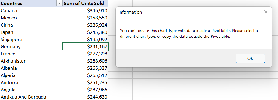
In the screenshot below, we tried to insert a map chart based on the PivotTable data. However, we can see that we are unable to create this type of chart inside a Pivot Table. 

Error message displayed

It is possible to create a map chart that uses Pivot Table data, we just need to use a simple work-around. 

The same workaround needs to be employed if trying to create many of the newer chart types: Sunburst, Treemap, Waterfall, Box and Whisker, Histogram and Funnel charts using PivotTable data. 

Related:

How to Create an Excel Heat Map? 5 Simple Steps

How to Custom Sort Excel Data? 2 Easy Steps

Battle of the Excel Lookup Functions: VLOOKUP vs INDEX/MATCH vs XLOOKUP

How to Create an Excel Map Chart?

First, we need to ensure that the data we want to use in the map chart is appropriate. Map charts only work with geographical data so we must have a field that contains countries, regions, zip codes, states etc. in the PivotTable. 

Ensure that your pivot table contains proper geographical data

If we try to create a map chart directly from our Pivot Table, we will receive a message letting us know we cannot create this chart type using data inside a Pivot Table. 

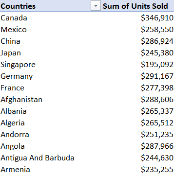
Step 1: Copy the Pivot table data

The solution is to remove the data from Pivot Table first and then create the map chart. 

  • Click in the PivotTable and press Ctrl+A to select all the data. 
  • Click in a blank cell somewhere else in the worksheet. 
  • From the Home tab, in the Clipboard group, click the lower-half of the Paste button. 
  • Click Paste Values. 
Copy and paste the pivot table data some where else

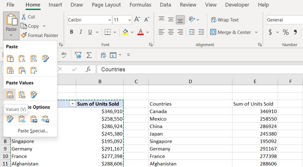
This removes the data from the PivotTable and pastes it as plain text without any formatting. We can use this data to create the map chart. 

Step 2: Create a cap chart using the copied data

  • Click inside the new data. 
  • From the Insert tab, in the Charts group, click Maps. 
  • Select Filled Map.  

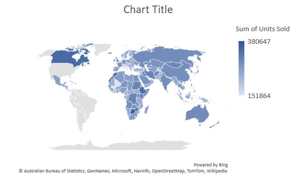
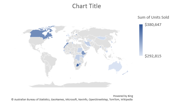
Each country that’s included in the dataset is represented on the map and shaded according to its value. In this example, the higher the number of units sold, the darker the blue shading. 

Excel Map Chart
Excel Map Chart

This looks good; however, we have a problem. If the PivotTable data changes, the map chart will not update as it is not using the PivotTable data to populate the values. We need to modify the chart and point it back to the PivotTable data. 

Step 3: Link the map chart to the pivot table

  • Click on the chart. 
  • From the Chart Design tab, in the Data group, click Select Data. 
  • In the Select Data Source dialog box, click the up arrow next to Chart data range. 
  • Select the PivotTable data. 
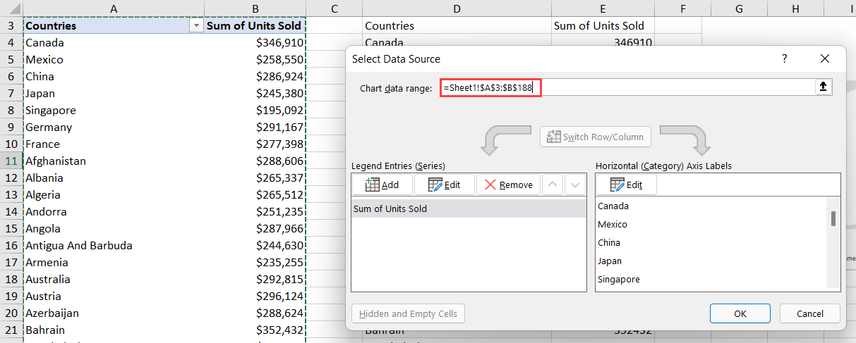
Link the map chart to the pivot table
  • Click OK. 

The map chart is now using the PivotTable data so we can delete the copied data. 

  • Click inside the copied data and press CTRL+A to select all. 
  • Press the Delete key. 

Try making a change to the PivotTable to make sure the map chart updates. Here, I have applied a Top 10 Filter to the PivotTable to only show the top 50 countries by the sum of units sold. 

An Excel map chart linked with a pivot table.

Suggested Reads:

How to Print Gridlines in Excel?

Start Co-Authoring Excel Workbooks in 6 Easy Steps

How to Insert a Page Break in Excel? (3 Simple Steps)

How to Format an Excel Map Chart?

We can apply formatting to our map chart using the Chart Design and Format ribbons. These are contextual ribbons that only display when we are clicked on the chart. 

Open the Chart Design tab
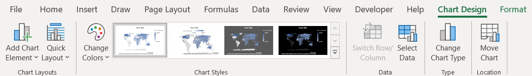
  • From the Chart Design tab, in the Chart Styles group, select Style 2. 
  • From the Chart Design tab, in the Chart Styles group, click Change Colors. 
  • Choose Colorful Palette 3 from the gallery. 
Choose an appropriate color palette
  • Click the + next to the chart. 
  • Hover the mouse over Legend. 
  • Choose Right from the menu. 
Use the Chart Elements section to add or modify the chart elements
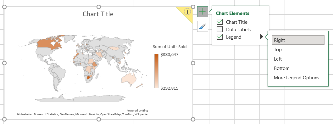
  • Double-click on the Chart Title. 
  • Change the title to ‘Sum of Units Sold by Country’. 

More formatting options can be found in the right-click menu. 

  • Click on the part of the chart to format.  
  • Right-click and select Format Data Series from the menu. 
Right-click on the chart to access the Format Data Series pane.

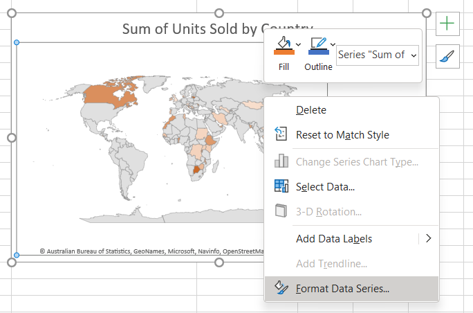
From the Format Data Series pane, we have access to many more formatting options. 

Access the format data series section for more settings

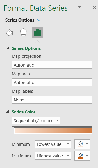
The options we see in this pane change depending on which part of the chart we select, e.g., if we click on the ‘Chart Title’ we will see formatting options related to the title. 

Also Read:

Arrow Keys Not Working in Excel – 4 Easy Fixes

How to Record a Macro in Excel? In 6 Easy Steps (For Dummies)

6 Easy Methods to Strikethrough in Excel

Closing Thoughts

In this guide, we saw how to create an Excel map chart using pivot tables. I recommend you practice these steps in a sample worksheet to gain a better understanding.

Visit our free Excel Resources Centre for more high-quality Excel guides. 

Want to learn more about Excel? Click here to access our advanced Excel courses with in-depth training modules. 

You can train your entire team in Excel and other business software, for a single low monthly fee by clicking here.

Deborah Ashby

Deborah Ashby is a TAP Accredited IT Trainer, specializing in the design, delivery, and facilitation of Microsoft courses both online and in the classroom. She has over 11 years of IT Training Experience and 24 years in the IT Industry. To date, she's trained over 10,000 people in the UK and overseas at companies such as HMRC, the Metropolitan Police, Parliament, SKY, Microsoft, Kew Gardens, Norton Rose Fulbright LLP. She's a qualified MOS Master for 2010, 2013, and 2016 editions of Microsoft Office and is COLF and TAP Accredited and a member of The British Learning Institute.

30 day vertical banner

Most Popular Posts

  • How to Insert a Checkbox in Excel? 3 EASY Examples
  • How to Autofit Excel Cells? 3 Best Methods
  • XLOOKUP Google Sheets – 4 Best Alternatives!
  • Dashboards in Excel Using Pivot Tables, Pivot Charts and Slicers
  • Free Microsoft Project Training Course
  • Free Microsoft Access Tutorial for Beginners (3.5 Hours Video)
  • How to Use Blending Mode With Layers in Adobe Photoshop Elements 15
  • How to Create Charts and Graphs in Microsoft Excel 2016

Similar Posts

Time-Saving Tips for PowerPoint 2010

Adding Resources to a Project Using the Resource Sheet in Microsoft Project 2016

Using Speech Recognition in Windows 8

Editing Images with Photoshop CS6 Camera Raw

How to Group Worksheets in Excel? (In 3 Simple Steps)

How to Add Error Bars in Excel? 7 Best Methods

Course Categories

  • Web Development
  • QuickBooks
  • Microsoft
  • Adobe
  • Data Analysis

About Us

  • About Us
  • Free Resources
  • Affiliates
  • Become an Instructor

Products

  • Pricing and Plans
  • Business Pricing
  • Government Discounts
  • Non-Profit Discounts

Support

  • FAQ’s
  • Contact Us
  • DVD support

Connect

YoutubeFacebook
© 2022 Simon Sez IT, Inc.
  • Terms
  • Privacy Policy
888.817.6665 Monday thru Friday 7:30 a.m. - 5:00 p.m. (ET)